
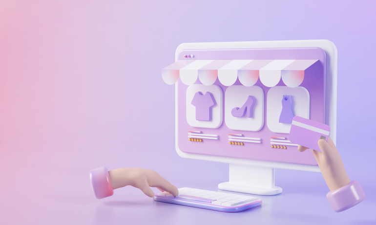
Your Product Page is the Salesperson
In a brick-and-mortar store, customers can touch, feel, and ask questions about a product. In e-commerce, your product page does all the talking.
The difference between a browser and a buyer? It’s often the design of your product page—how it looks, flows, and responds. A high-converting Shopify product page isn’t just informative. It’s persuasive, emotionally engaging, and friction-free.
Let’s explore how smart design choices can transform a Shopify product page from a static screen to a powerful conversion tool.
🧠 Why Design Drives Conversions
The right design doesn’t just showcase your product—it builds trust, reduces hesitation, and nudges users toward “Add to Cart.”
📦 Highlights product value instantly
🛒 Reduces uncertainty with social proof and details
🎨 Creates a memorable visual experience
⚡ Speeds up decision-making with intuitive flow
Conversion is a design outcome, not just a marketing goal.
🔧 Elements of a High-Converting Shopify Product Page
📌 Hero Image That Sells Emotion
🔍 Use high-resolution, zoomable product images
🖼 Include lifestyle shots to show real-world use
🎥 Add product videos or 360° views
🌟 Ensure mobile optimization for every image type
Visuals should answer: “Can I see myself using this?”
📌 Clear, Scannable Product Titles & Descriptions
🖊️ Keep product titles simple and keyword-friendly
✏️ Write benefit-driven descriptions, not just features
📋 Use bullets or short paragraphs for easy reading
💬 Address common questions directly in the copy
Tell a story. Show the value. Skip the fluff.
📌 Price, Options & Variants That Are Easy to Choose
💲 Display pricing clearly—including discounts or bundles
🎨 Show swatches or thumbnails for color/size options
⏱ Use dynamic UI to update pricing/availability instantly
🔄 Make quantity selection intuitive
Complex = friction. Simplify every interaction.
📌 Strong, Visible Call-to-Action
🟢 Use a bold “Add to Cart” button with contrast
🟢 Keep it above the fold AND repeat below details
🟢 Use persuasive text like “Get Yours Now” or “Only X Left”
🟢 Add subtle urgency (low stock, shipping deadlines)
The CTA should stand out without screaming.
📌 Social Proof That Builds Trust
⭐ Display reviews with ratings and real photos
🧾 Include total reviews count to show popularity
👤 Show reviewer info for authenticity (name, verified badge)
💬 Allow Q&A or customer feedback section
People trust people more than brands.
📌 Shipping, Returns, and Guarantees
📦 Clearly state shipping timelines and cost
🔄 Offer easy-to-read return/refund policies
🛡️ Display money-back guarantees or security badges
🧭 Keep this near CTA or description—not buried in footers
Transparency = confidence = higher conversion.
📌 Additional Conversion Boosters
✨ Countdown timers for limited-time offers
🔔 Back-in-stock or pre-order options
💌 Wishlist/save feature for retargeting
📊 “Frequently bought together” or upsell sections
These subtle add-ons increase AOV and urgency without overwhelming users.
✨ Real-World Example: From Browsers to Buyers
An online jewelry brand redesigned their Shopify product pages with these changes:
✅ Swapped plain images for lifestyle shots + video
✅ Simplified descriptions to highlight emotional benefits
✅ Added review images and a size guide
✅ Moved key info above the fold
📈 Result: Conversion rate jumped from 1.9% to 3.7% in 4 weeks.
Small UI updates = big sales impact.
⚠️ Common Design Mistakes to Avoid
❌ Cluttered layouts that distract from the CTA
❌ Slow-loading galleries or videos
❌ Generic product descriptions that don’t convert
❌ Invisible or confusing variant selectors
❌ Missing return/shipping info
If your page creates questions or friction, users will bounce.
🧾 Final Takeaway: Every Pixel Should Earn Its Place
A high-converting Shopify product page doesn’t overload—it guides, reassures, and motivates. Every visual, word, and button should exist to move the user closer to purchase.
Good design makes them click. Great design makes them buy—and come back.
💬 What’s Your Favorite Product Page Trick?
Seen a product page that made you buy instantly? Or built one that converted like crazy? Share your tips, ideas, or tools in the comments 👇


4 Comments
Megan Roberts
18 April 2025Loved the reminder that “conversion is a design outcome.” I updated one of my product pages with lifestyle images and saw an instant drop in bounce. Visual storytelling really works!
Chris Miller
18 April 2025Honestly, the placement of the CTA made a huge difference for me. I moved it above the fold AND repeated it—and my add-to-cart clicks increased noticeably. Great advice here!
Jasmine Bennett
18 April 2025Such a helpful breakdown. I always forget how important mobile optimization is for product imagery—especially zoom and swipe gestures. Bookmarking this one!
Liam Parker
18 April 2025The example with the jewelry store is so on point. It’s amazing how a few intentional design updates can double conversion. Super inspiring for smaller brands like mine.