
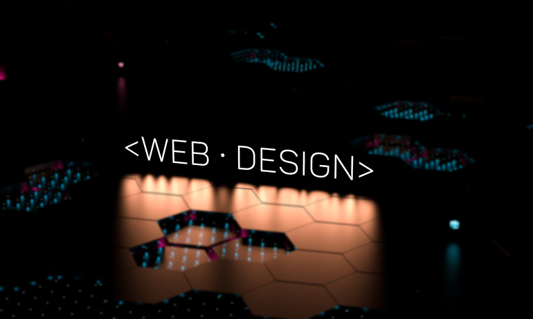
Movement = Meaning
Static websites might inform—but interactive websites connect.
In Webflow, interactions aren’t just visual flourishes—they’re communication tools. From subtle hover effects to scroll-triggered animations, every interaction shapes how users feel, engage, and understand your design.
Done right, Webflow interactions transform a static page into a living, responsive experience. Let’s dive into the why and how.
💡 Why Interactions Matter in Modern Web Design
Every second on a site is a conversation. Interactions help guide that conversation.
🔹 They provide instant visual feedback to user actions
🔹 They guide attention and create narrative flow
🔹 They make interfaces feel alive, human, and delightful
🔹 They improve engagement and reduce bounce rates
In Webflow, interactions enhance function through motion.
🧠 1. Guide Attention with Scroll-Based Animations
Scroll-triggered interactions help tell a story visually.
🔸 Reveal elements with fade-ins or slide-ins as users scroll
🔸 Pin sections to highlight key messages
🔸 Use parallax effects to create depth and movement
🔸 Animate key visuals without overwhelming the user
These help users move with the content—not just past it.
🖱 2. Use Hover States to Improve UI Clarity
Hover animations provide micro-feedback that improves usability.
🔹 Highlight links, buttons, or cards when hovered
🔹 Add tooltips, shadows, or slight scaling to show interactivity
🔹 Keep transitions fast—between 150–300ms for best flow
🔹 Avoid excessive movement that distracts or disorients
Hover = subtle confidence-building for your users.
🧩 3. Trigger Interactions Based on User Behavior
With Webflow’s interaction tools, behavior-based design is simple.
🔸 Animate modals or dropdowns when users click or tap
🔸 Expand sections on scroll or hover for progressive content
🔸 Display callouts or alerts after a time delay or scroll position
🔸 Change elements dynamically based on page state
These interactions keep the user engaged, not passive.
🎨 4. Blend Animations Into Brand Personality
Motion isn’t just functional—it’s emotional.
🔹 Use animation style (bounce, ease-in, fade) to match tone
🔹 Add storytelling sequences through scroll-tied reveals
🔹 Combine Lottie animations or SVG morphs for deeper control
🔹 Stick to 1–2 signature animation styles for consistency
Motion speaks. Make sure it says the right thing about your brand.
✨ Real-World Example: Webflow Interactions in Action
A creative agency used Webflow interactions to overhaul their services page:
✅ Animated card reveals on scroll
✅ Micro-hover effects on service icons
✅ Sticky header interactions that shrink on scroll
✅ Animated counters and stats on visibility
📈 Result: 38% increase in average scroll depth and longer user sessions.
The difference? Static layout → Interactive journey.
⚠️ Interaction Mistakes to Avoid
Even beautiful animations can hurt UX when:
❌ They delay content from loading or appearing
❌ They run too long or block interactions
❌ There’s no visual feedback for user input
❌ They’re inconsistent across pages or devices
❌ Motion causes distraction instead of focus
If it adds confusion, it subtracts value.
🧾 Final Takeaway: Motion That Serves the Message
In Webflow, interactions let you build experiences, not just layouts.
When used with strategy and restraint, they guide attention, reinforce hierarchy, and create a sense of rhythm. They turn design from passive to persuasive.
Use motion not because you can—but because it makes the story clearer.
💬 What’s Your Favorite Webflow Interaction?
Have you used a scroll trick, hover animation, or microinteraction that impressed users? Share your Webflow motion wins in the comments 👇


2 Comments
Jordan Lee
16 May 2025Loved the reminder that “hover = subtle confidence.” I’ve seen tooltips boost clarity instantly. Any tips for keeping hover effects smooth on mobile too?
Lena Park
16 May 2025Such a good point about restraint. I’ve definitely over-animated before 😅 Do you follow any specific “max interaction per page” rule?