
🎬 Introduction: The 5-Second Test
Here’s the brutal truth:
If your homepage doesn’t grab attention in 5 seconds, you’ve already lost the user.
In today’s digital world, attention is scarce and competition is fierce. Your homepage isn’t just a welcome mat—it’s your first pitch, your brand ambassador, and your conversion engine.
Crafting a compelling homepage means more than making it pretty. It needs to tell your story, guide your users, and deliver value instantly.
Let’s break down the psychology, structure, and strategy behind a homepage that not only looks good—but works hard.
🧠 Step 1: Know Your Audience Inside Out
Before you start designing a single section, get clear on this:
🕵️♂️ Who is your ideal visitor?
📍 What are they hoping to find on your homepage?
📉 What confuses or frustrates them about your competitors’ sites?
🎯 What action do you want them to take?
Whether your audience is startup founders, students, or SaaS buyers, your homepage should speak their language and solve their problems from the first scroll.
✍️ Step 2: Craft a Magnetic Value Proposition
You’ve got 3–5 seconds. Use them wisely.
Your value proposition is the headline (and sub-headline) that explains:
✅ What your product/service does
✅ Who it helps
✅ Why it’s better or different
🎯 Example: “Design Tools Made for Real Teams — Build, test, and ship faster with our all-in-one design platform.”
It should be above the fold, clear, bold, and completely user-centered.
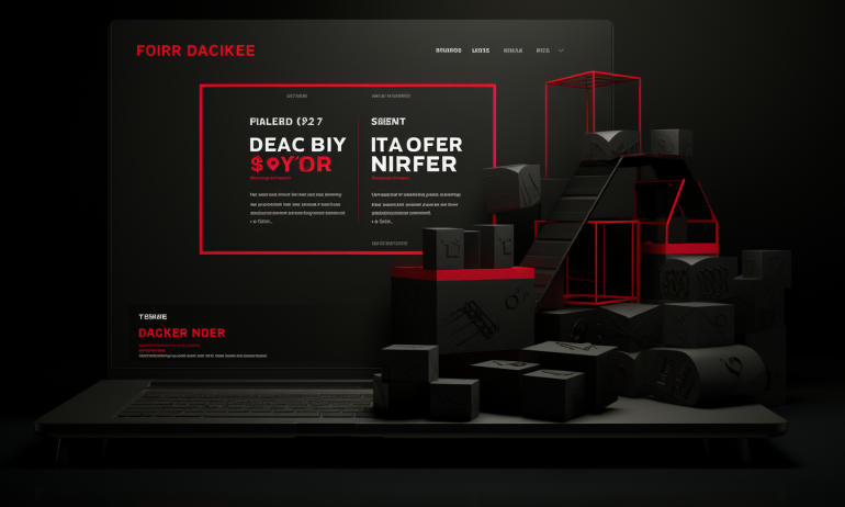
🎨 Step 3: Design the Hero Section to Convert
Your hero section is like a movie trailer. It needs to hook the viewer.
Elements to include:
🖼 A strong headline and sub-headline
📲 A visual preview (screenshot, mockup, or video demo)
👆 A clear CTA (Call to Action) button: “Get Started,” “Book a Demo,” etc.
💬 Optional trust indicators: user stats, review logos, or testimonials
Make sure it looks stunning on both desktop and mobile—this is your biggest attention asset.
🧩 Step 4: Structure Content with Purpose and Flow
Your homepage is not a dumping ground. It’s a narrative journey.
Here’s a proven section flow that converts:
-
✅ Hero Section – Instant value and CTA
-
💡 Problem & Solution – Highlight the user pain point and how you solve it
-
🛠 Features Preview – 3–4 killer features, no fluff
-
📣 Social Proof – Testimonials, case studies, media mentions
-
📊 Success Metrics or Trust Signals – “Used by 100K+ teams worldwide”
-
🔁 How It Works / Process Overview – Simple steps or explainer
-
📩 Final CTA / Email Capture – Reinforce conversion before they exit
Each section should push the user closer to conversion—not distract them.
💬 Step 5: Use Language That Connects, Not Confuses
Avoid jargon. Avoid fluff. Avoid being clever over clear.
Write in a tone that fits your brand—but always:
📌 Be benefit-driven, not feature-drenched
📌 Use short, punchy paragraphs
📌 Speak like a human, not a sales robot
📌 Use verbs that inspire action: explore, discover, get, build, grow
Remember: clarity converts. Confusion costs.
🎥 Step 6: Add Visuals That Tell a Story
Good visuals don’t decorate—they communicate.
Use:
🖼 Hero illustrations or mockups that show your product in action
🎞 Short demo videos or screen walkthroughs
🧠 Infographics or diagrams for technical products
✅ Icons or UI snippets that summarize key features
And of course: optimize for speed. Slow images = high bounce rates.
🛠 Step 7: Design for Scanning, Not Reading
Most users scan. Your homepage should support that behavior.
🪄 Use strong headings and subheadings
🪄 Highlight key benefits in bold
🪄 Use bullet points (or better—visual cards)
🪄 Break up text with icons, white space, and images
🪄 Make buttons obvious and above the fold
Hierarchy helps users navigate without friction.
📉 Real-World Example: Homepage That Skyrocketed Conversions
A productivity SaaS tool had great features but poor signups. After analyzing their homepage, here’s what changed:
❌ Removed a jargon-heavy hero message
❌ Replaced a stock image with a real product demo
❌ Cut 3 sections that distracted from the CTA
❌ Simplified language to focus on benefits
📈 Result: 57% increase in free trial signups within one month.
Your homepage shouldn’t explain everything. It should motivate the next click.
⚠️ Common Homepage Mistakes
Avoid these traps if you want your homepage to work:
❌ Too many CTAs = decision paralysis
❌ Sliders/carousels that hide value
❌ Wall of text without visual relief
❌ Fluffy language that says nothing
❌ No clear next step or CTA
Don’t just aim to impress—aim to guide.
🔮 Bonus: Homepage Checklist
Before you hit publish, ask yourself:
✅ Is my value prop instantly clear?
✅ Is my CTA visible and actionable?
✅ Does the page adapt beautifully on all devices?
✅ Do I show real trust signals?
✅ Does the page load in under 3 seconds?
✅ Is there a clear, structured flow?
If you can check these off—you’ve got a homepage built to convert.
🧾 Final Takeaway: Design the First Step in the Journey
Your homepage is not the destination—it’s the beginning.
It’s where curiosity meets clarity. Where new visitors decide whether to bounce or explore deeper. Make sure it’s designed with empathy, intention, and value in every pixel.
So the next time you redesign your homepage, don’t ask:
“What should I include?”
Ask instead:
“What does my user need to feel, know, and do in 5 seconds or less?”
Then build that experience—and watch your conversions climb.
💬 What’s the Most Important Section on a Homepage?
Is it the hero? The testimonials? The features list?
Drop your answer below 👇 and let’s discuss what really matters!


4 Comments
Laila Thompson
10 June 2025“Curiosity meets clarity” — what a brilliant way to describe a homepage 🧠
Saif Ali
10 June 2025Loved the 5-second rule reminder! It really is make or break
Ruby Chen
10 June 2025The section flow checklist = gold 🙌 Gonna use that for my next project!
Mateo Rivera
10 June 2025That CTA clarity point hit home. One clear path > multiple confusing ones 💡