
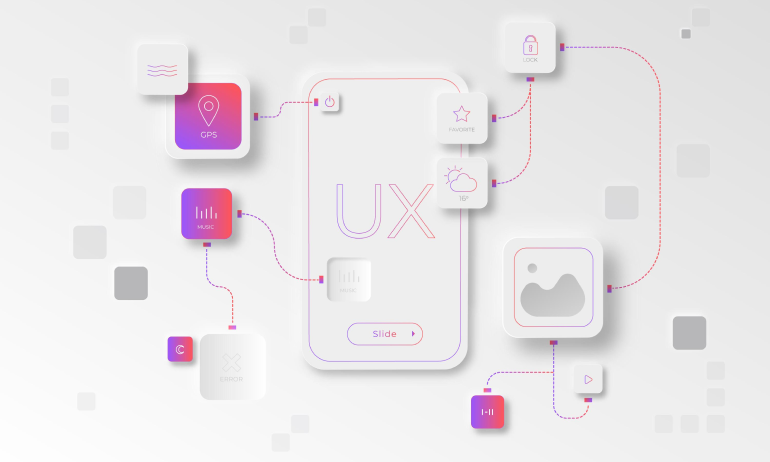
Behind Every Click Is a Human Mind
Design isn’t just about pixels—it’s about people.
Behind every tap, scroll, or swipe lies a psychological response. When you design for how people think, not just how they look, you build products that feel intuitive, engaging, and unforgettable.
Psychology is the secret ingredient behind great UX. It helps us understand why users behave the way they do, and how design can support, guide, or even influence their choices.
In this post, we’ll explore the core psychological principles that drive user behavior—and how to apply them strategically in your UI/UX work.
🧠 Want to combine psychology with client collaboration? Read How to Manage Client Expectations in Design Projects
🧠 Why Psychology Matters in UI/UX
Users don’t consciously evaluate every button or layout—they react based on instinct, habit, and emotion.
By applying psychology in design, you can:
✔️ Make navigation feel intuitive
✔️ Reduce cognitive load and decision fatigue
✔️ Influence user behavior ethically
✔️ Boost trust and emotional connection
✔️ Create more accessible and inclusive experiences
Great UI isn’t just “usable”—it feels natural and familiar, because it aligns with how the brain works.
🧩 1. Cognitive Load and the Simplicity Principle
Cognitive load refers to the mental effort needed to process information. The more complex a UI, the more brainpower it demands.
🎯 Use minimal, clean layouts with a clear visual hierarchy
📦 Chunk content into digestible sections (like cards or steps)
🧭 Limit choices to avoid analysis paralysis
🔄 Repeat patterns—don’t make users relearn layouts on every page
📚 Example: Hick’s Law states that more choices = slower decisions. Use this when designing navigation menus or product filters.
👀 2. Visual Hierarchy and Gestalt Principles
Gestalt psychology explains how people organize visual information. Your users subconsciously group elements based on:
🔹 Proximity – Close elements are seen as related
🔹 Similarity – Shared colors or styles group elements
🔹 Continuity – Aligned layouts guide the eye
🔹 Figure & Ground – Foreground items must contrast from the background
Use these to create scannable, logical interfaces that feel effortless.
🧠 Want to master visual hierarchy? Check out our blog on Visual Hierarchy in UI Design
🎯 3. Behavior Triggers and Fogg’s Model
According to BJ Fogg’s Behavior Model:
Behavior = Motivation + Ability + Trigger
Your design should align all three:
✅ Motivation – What’s the user trying to achieve?
✅ Ability – How easy is the task to complete?
✅ Trigger – Is there a clear cue to act (button, notification, CTA)?
Example: A user wants to save a product. The CTA “Save to Wishlist” is visible, requires one tap, and provides feedback. That’s behavior design in action.
😌 4. Emotional Design and the Aesthetic-Usability Effect
Users judge first by feel, then by function.
According to the aesthetic-usability effect, users perceive attractive interfaces as more usable—even if they’re not.
Use emotion wisely:
💡 Warm colors and microinteractions create joy
💬 Friendly microcopy reduces tension (especially in error states)
🌙 Dark mode and soft contrast can make designs feel calmer
🎉 Celebrate success (like confetti after a form submission)
Emotion isn’t fluff—it’s function wrapped in feeling.
📉 5. Familiarity and Mental Models
People expect interfaces to behave like things they already know.
🧠 Mental models are internal assumptions users have about how something should work. Your job? Design around those expectations.
💡 Put carts, menus, and search in predictable places
💡 Use iconography that matches user expectations (magnifying glass = search)
💡 Don’t “surprise and delight” if it confuses and frustrates
When in doubt, align with conventions—then evolve gradually.
🧪 Real-World Example: When Psychology Improved UX
A healthcare startup redesigned their symptom checker. The original UI had:
❌ Technical language
❌ Overwhelming input fields
❌ No guidance or emotional tone
After applying psychology-based design:
✅ Reduced form fields into progressive steps (chunking)
✅ Used plain language and empathetic microcopy
✅ Added trust indicators and confirmation messages
📈 Result: Form completion rate jumped from 37% to 76%.
Human-first design = higher engagement and trust.
⚠️ Common Mistakes Designers Make with Psychology
❌ Using psychological principles to manipulate (dark UX)
❌ Adding complexity in the name of aesthetics
❌ Ignoring accessibility or neurodiversity
❌ Copying patterns without understanding the behavior behind them
❌ Skipping user research in favor of theory
Psychology must support users, not trick them.
🔍 Tools to Apply Psychology in Your Design Process
🧠 Laws of UX – UX psychology principles explained
🔍 NNG Articles – Research-driven design advice
🧪 Maze – Test behavior and usability with real users
🗂 Notion – Create behavior maps and emotion checklists
🎨 Figma – Test hierarchy, layout, and UX flows collaboratively
🧾 Final Takeaway: Design for the Mind, Not Just the Interface
Design isn’t about what users see. It’s about what they feel, expect, and do.
By integrating psychological principles into your UX process, you make your designs:
✔️ More intuitive
✔️ More engaging
✔️ More ethical
✔️ More successful
Because the best design isn’t just clever—it’s cognitively aligned with the user.
💬 What’s Your Favorite UX Psychology Principle?
Do you use Hick’s Law? Fogg’s Model? Aesthetic-usability effect?
Drop your favorite principle below 👇 and let’s make design smarter—together.


5 Comments
Joshua Meyer
1 July 2025Just added “Fogg’s Behavior Model” to my design checklist. Super useful!
Farah Qadri
1 July 2025That real-world healthcare UX example was 🔥 Human-first design really works.
Jen Tanaka
1 July 2025This is the psychology crash course every designer needs 🙌
Ava Castillo
1 July 2025Loved the balance between emotion and structure here. Great read!
Bilal Noor
1 July 2025Always avoided dark mode—until I read this. Now I’m rethinking flow + feel. 🌙