
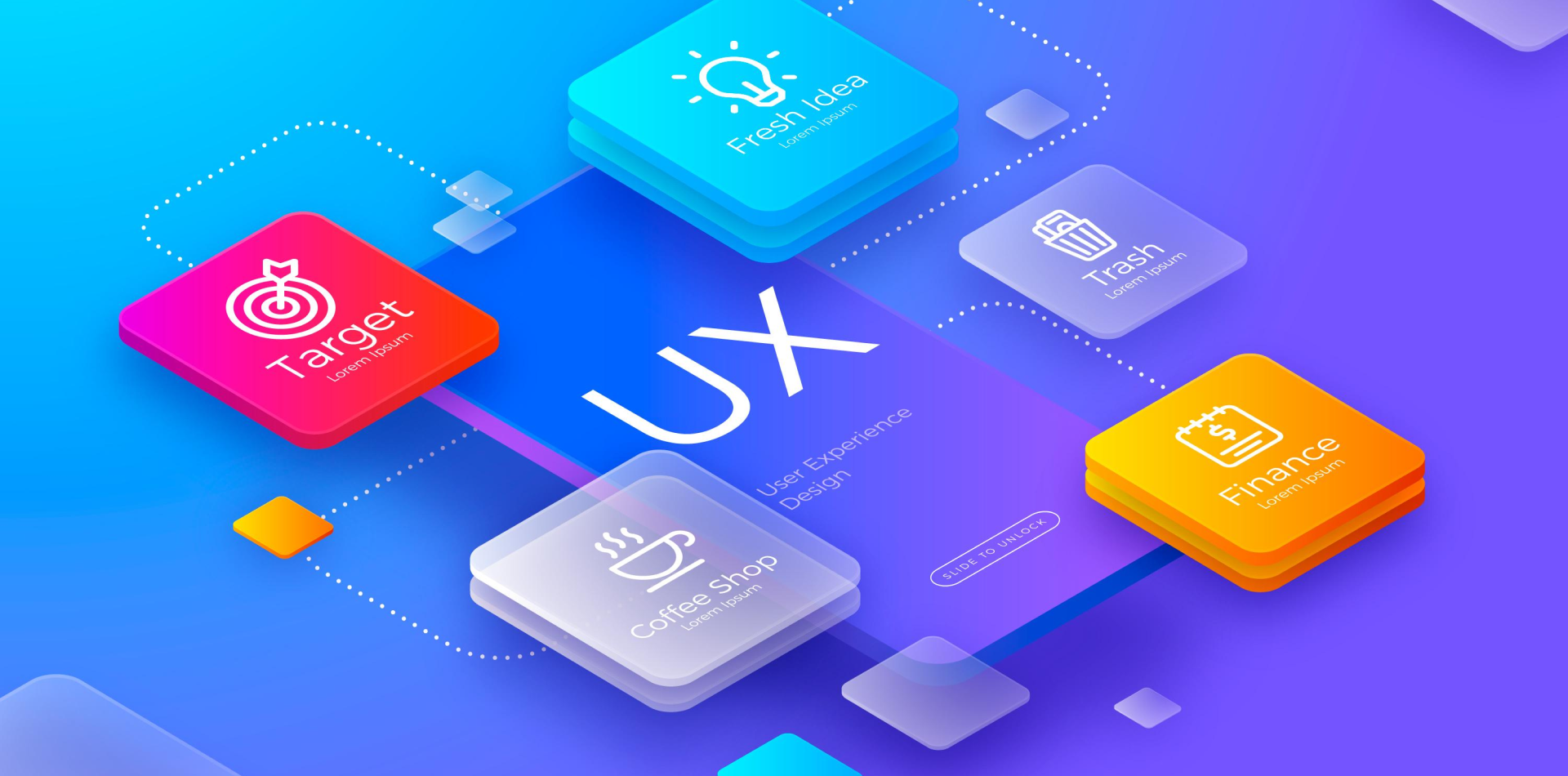
Patterns That Power Intuition
Design isn’t just about creativity—it’s about consistency, clarity, and usability.
In the world of web apps, design patterns act as a shared language. They solve common UX problems through proven interface models. When used wisely, these patterns help users navigate faster, act smarter, and engage deeper.
This blog will explore the most impactful design patterns used in modern web apps—what they are, why they work, and how to use them in your own products without falling into the trap of copy-paste design.
🧠 Also read: How to Create Intuitive User Flows for Better UX

What Are Web App Design Patterns?
Design patterns are reusable solutions to common UI problems.
Think of them as the architectural blueprints of digital interfaces. They don’t dictate how things should look but provide structural consistency across tasks, screens, and platforms.
✅ They reduce the user’s learning curve
✅ Boost trust by reinforcing expectations
✅ Help teams move faster and scale design systems
Patterns aren’t templates—they’re strategies.
1. Master-Detail Layout: Context + Control
Used in file managers, inboxes, and admin dashboards, this pattern splits the screen:
🧩 Left = Master list (emails, items, users)
🧩 Right = Detail view of selected content
💡 Why it works: Keeps users grounded in their context. Reduces page reloads and helps with multi-tasking.
🔗 Seen in: Notion, Slack, GitHub Issues
2. Card-Based Grids: Scan & Act Quickly
Cards segment data into clickable, visual blocks.
🧩 Ideal for:
-
Product listings
-
User profiles
-
Dashboards
-
Notifications
💡 Why it works: Improves scanability. Feels modular and mobile-ready. Enables drag-and-drop functionality with ease.
🛠 Try in Webflow or Framer for no-code layout management.
3. Persistent Navigation: Always There When You Need It
Web apps often have complex flows. Persistent nav bars—top or side—ensure users never feel lost.
🧩 Includes:
-
Global top nav
-
Left-side main nav (with icons/labels)
-
Account or tool-specific mini navs
💡 Why it works: Provides orientation and reduces bounce rates. Works beautifully with role-based dashboards.
📚 Used in: Linear, ClickUp, Figma
4. Progressive Disclosure: Simplicity at Scale
Overloading users with every option upfront kills UX. Progressive disclosure keeps UIs light while revealing depth when needed.
🧩 Examples:
-
Hidden advanced settings
-
“Show more” buttons
-
Collapsible filters and tabs
💡 Why it works: Prioritizes clarity. Supports both novice and advanced users. Reduces visual noise.
🔗 Related: Nielsen Norman Group on Progressive Disclosure
5. Modal vs Drawer UI: Know When to Interrupt
Overlays are useful—but only when timed right.
🧩 Use Modals for:
-
Confirmations
-
Forms
-
Critical alerts
🧩 Use Drawers for:
-
Secondary menus
-
Filters
-
Task details
💡 Why it works: Modals demand focus; drawers preserve flow. The right choice enhances task completion.
6. Toast & Snackbar Notifications: Lightweight Feedback
Feedback builds trust. Use small, temporary messages to guide users—without stopping them.
🧩 Use for:
-
Form submissions
-
Autosave alerts
-
Error messages
-
Task completions
💡 Why it works: Non-blocking. Gives users reassurance. Doesn’t disrupt the journey.
📌 Use pattern libraries like Material UI or Ant Design for quick implementation.
Real Example: SaaS Redesign Using Better Patterns
A project management web app suffered from:
❌ Too many modals
❌ Hidden key actions
❌ Inconsistent nav placement
After redesign:
✅ Adopted persistent side navigation
✅ Replaced modals with drawers
✅ Used progressive disclosure in settings
✅ Introduced toast messages and cards
📈 Result: 48% increase in feature adoption and 30% drop in support tickets.
Pattern logic made the product intuitive.
Mistakes to Avoid with Design Patterns
❌ Blindly copying patterns without understanding their purpose
❌ Misusing modals for non-critical info
❌ Ignoring mobile responsiveness
❌ Not testing interactions with real users
❌ Forgetting accessibility (like ARIA roles or keyboard nav)
Patterns are foundational, not final—they must be tested and adapted.
Helpful Tools & Libraries
🛠 Figma Community – Ready-to-use design patterns
📚 UI Patterns – Detailed pattern explanations
🎨 Ant Design – Enterprise-ready React components
🔁 UXPin – Interactive pattern-based prototyping
📊 Hotjar – Test user flows and pattern effectiveness
Final Takeaway: Use Patterns with Purpose
Design patterns are the grammar of interface language.
They make apps usable, scalable, and intuitive. But just like language, their power lies in how and when you use them.
✔️ Identify user pain points
✔️ Choose a pattern that solves the core problem
✔️ Customize it to fit your product and users
✔️ Test and refine based on feedback
Because the best apps don’t just use design patterns—they adapt them beautifully.
💬 Your Turn: What’s Your Go-To Pattern?
Is there a design pattern you rely on again and again?
Drop it in the comments 👇 and let’s build smarter web apps—together.
4 Comments
Jason Lin
4 July 2025The master-detail layout always saves my dashboard designs. Glad to see it explained so well! 💡
Eva Thompson
4 July 2025Love the line: “Patterns are strategies, not templates.” 🔁 That really shifts how I think.
Clara Nguyen
4 July 2025I always start with card layouts on new products. Versatile, beautiful, and user-friendly 💫
Jamie Soto
4 July 2025Great read! The pattern vs template difference is something I’ll now explain to every junior designer I mentor.