Blogs That Hold Attention Win the Game
A blog that looks good isn’t enough.
A blog that keeps readers scrolling, clicking, and sharing? That’s where design magic happens.
When designing a WordPress blog, your layout, typography, navigation, and interactive elements all contribute to how long readers stay—and how often they come back. In an age of shrinking attention spans, the design of your blog must do more than display content—it must invite interaction.
In this guide, we’ll explore how to design your WordPress blog for maximum engagement, without relying on gimmicks.
🧠 Related read: How Great Design Enhances User Trust and Loyalty
1. Start with a Clean, Distraction-Free Layout
First impressions matter—and clutter kills them.
✅ Use white space to make content breathable
✅ Avoid noisy sidebars or excessive popups
✅ Stick to 1–2 key fonts and colors for brand consistency
✅ Use a clear content width (usually 600–750px) for readability
💡 Tip: Choose minimalist, mobile-first WordPress themes like Astra, Kadence, or GeneratePress.
🔗 Resource: Best WordPress Blog Themes for Speed & UX – ThemeIsle
2. Typography That Makes Reading a Pleasure
Typography is UX. Fonts guide the eye and shape the reading experience.
✔️ Use legible serif or sans-serif fonts (e.g., Inter, Open Sans, Lora)
✔️ Set comfortable line height (1.6–1.8) and font size (18–20px)
✔️ Break up long paragraphs with subheadings and visuals
✔️ Use bold/italic for emphasis—not just for style
📌 Bonus: Use a consistent heading hierarchy (H1 for titles, H2 for sections, H3 for subpoints) for both design and SEO.
3. Design for Mobile-First Scrolling
Over 60% of blog traffic comes from mobile devices.
✅ Use responsive design with breakpoints for phones/tablets
✅ Avoid horizontal scroll or oversized images
✅ Keep CTAs easily tappable and not too close together
✅ Test mobile speed using Google’s Mobile-Friendly Test
🧠 Read more: Creating a Responsive Webflow Site
4. Use Strategic Navigation to Reduce Drop-Off
Your readers should never feel lost.
🎯 Add sticky navigation or header menus
🎯 Highlight your best content in the sidebar (not everything)
🎯 Use internal linking naturally inside paragraphs
🎯 Add “Previous/Next” blog post buttons
📌 Extra: A “Start Here” page or “Popular Reads” section helps new visitors engage fast.
🔗 See in action: https://ahmedhive.com/blog
5. Add Interactive Elements that Invite Action
Engagement = interaction.
✅ Use accordion toggles for FAQs or long guides
✅ Add simple polls or quizzes for fun input
✅ Embed Twitter/X, YouTube, or Instagram content natively
✅ Allow comments or reactions at the bottom of posts
🎨 Tool Tip: Use WPForms or Typeform to create interactive contact or feedback forms.
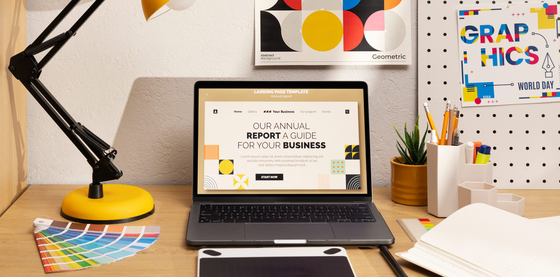
6. Visuals That Keep the Reader Scrolling
Great blog visuals break up content, add meaning, and keep things dynamic.
✔️ Use feature images with emotional or curious appeal
✔️ Embed relevant infographics or custom visuals
✔️ Avoid cheesy stock photos—use Unsplash or your own screenshots
✔️ Use visual cues like arrows or icons to direct attention
🛠 Image optimizer: ShortPixel for compressing images without quality loss
7. Smart Internal Linking = More Time on Site
Linking to related content increases both SEO and user session time.
✅ Link to older blogs using keyword-rich anchor text
✅ Add “Related Posts” at the end of each article
✅ Use sidebar or in-line modules to surface similar content
🧠 Related read: Tips for Staying Up-to-Date with Design Trends
💡 Bonus: Use a plugin like Yet Another Related Posts Plugin (YARPP) for automated related content.
8. Focus on Speed & Performance
If your blog loads slow, it doesn’t matter how good it looks—users bounce.
✅ Choose a lightweight theme
✅ Use a CDN (like Cloudflare)
✅ Minimize JS/CSS bloat
✅ Optimize every image before upload
✅ Use caching plugins like WP Rocket or W3 Total Cache
📊 Test your performance: PageSpeed Insights or GTmetrix
🧠 Bonus: The Importance of Website Speed in WordPress Design
Real-World Example: Engagement Through Smart Design
A personal finance blogger redesigned their WordPress blog with:
✅ Clear headings, progress indicators, and CTA buttons
✅ Internal links to topic clusters
✅ A sticky sidebar with “Start Here” and “Popular Guides”
✅ Mobile-optimized visuals and blockquotes
📈 Result? 2.7x increase in session duration and a 41% boost in email signups in 30 days.
Good content + good design = sticky engagement.
Common Design Mistakes That Kill Blog Engagement
❌ Center-aligning paragraphs or giant headlines
❌ Using too many fonts or colors
❌ Relying only on sidebar links for navigation
❌ Hiding CTAs or using vague labels
❌ Not optimizing for mobile readers
Every second counts. Every pixel matters.
Tools to Supercharge Your Blog Design
🛠 Elementor – Visual design freedom
🎨 Figma – Plan your layouts before building
🔎 RankMath – SEO plugin to guide smart structure
🧪 Hotjar – See how users interact with your content
🧰 Unsplash – Free, high-quality visuals
Final Takeaway: Design for Engagement, Not Just Looks
Your blog is more than a content dump—it’s a reader journey.
To truly engage, your design must:
✔️ Prioritize readability
✔️ Guide exploration
✔️ Minimize friction
✔️ Encourage interaction
✔️ Reflect personality
The most successful WordPress blogs are designed not just to be seen… but to be felt, explored, and remembered.
💬 What’s Your Favorite Blog Design Hack?
Got a CTA trick, layout flow, or visual idea that keeps readers hooked?
Share your WordPress engagement tips in the comments 👇 and let’s build better blogs together!


4 Comments
Daniel Cooper
18 July 2025“Your blog must invite interaction”—YES. That line alone changed how I think about layouts.
Marcus B.
18 July 2025I’ve been using 3 fonts on my blog… going to simplify now 😅 Thank you for the wake-up call!
Nathan Li
18 July 2025Visual hierarchy, mobile-first, fast loading… the holy trinity of blog design! Bookmarking this 💾
Carlos Mendes
18 July 2025Hotjar + YARPP + strong CTAs = chef’s kiss 💡 Love how actionable this whole guide is!