🌟 Introduction: The Magic You Can’t Explain
Ever used an app or website and thought, “Wow, this just feels right”?
You can’t always pinpoint why, but you know it’s good. That “invisible” comfort—when everything flows naturally, responds instantly, and never frustrates—is the result of intentional design choices that align with human intuition.
But how does that feeling happen?
And how do the best products in the world design for intuition, not just functionality?
Let’s explore the hidden layer that separates good products from great ones—the one that makes users feel at home even before they know how to use it.
🧠 Related Read:
Designing for Accessibility in Mobile Apps
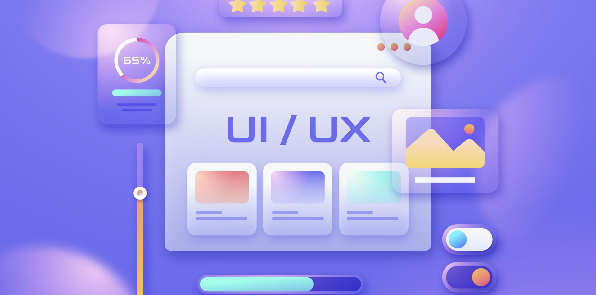
🧩 What Is Intuitive Design?
Intuitive design means users understand how to interact with a product without needing instructions.
It doesn’t mean “simple” or “minimal.”
It means familiar, predictable, and context-aware.
Here’s what makes a product intuitive:
🔹 It matches user expectations
🔹 It reduces cognitive load
🔹 It provides feedback at the right time
🔹 It guides without being obvious
🔹 It builds confidence without complexity
Intuitive design doesn’t teach. It feels learned already.
🎯 The Psychology Behind “Feeling Right”
Why does your brain love some products more than others?
The answer lies in mental models—internal maps your brain builds from past experiences. When a product aligns with your existing model, it feels intuitive. When it breaks those expectations, it feels confusing.
✨ Example: A trash icon to delete something just “makes sense” because you’ve seen it everywhere.
Designs that match mental models reduce friction and feel emotionally comfortable.
💬 Microinteractions: Small Details, Big Intuition
Microinteractions are the tiny visual or audio responses that guide user behavior.
🔸 A button ripple when clicked
🔸 A “ding” after sending a message
🔸 A loading spinner that reassures the user
🔸 A red shake when the password is wrong
They might be small, but they do something big:
They say, “Yes, your action was received—and here’s what’s happening.”
Without microinteractions, products feel lifeless.
With them, they feel alive, responsive, and trustworthy.
🧠 Internal Link:
The Role of Interactive Elements in Web App Design
📦 Affordances: Show Me What to Do (Without Saying It)
Affordances are design cues that suggest how something should be used.
Examples:
👉 A button looks pressable
👉 A slider has a track and thumb
👉 A card lifts on hover
They don’t need labels because their design tells you what to do.
Intuitive design uses visual language so well that users don’t have to think—they just act.
🔄 Feedback Loops: Closing the Action–Reaction Gap
When users do something, they expect the product to respond.
That’s where feedback loops come in:
✔️ Instant success messages
✔️ Clear error prompts
✔️ Progress indicators
✔️ Auto-saving cues
When feedback is missing, users feel lost.
When feedback is clear, users feel in control.
Control = confidence = “this feels right.”
📐 Consistency and Familiarity: The Invisible Comfort
Ever wonder why every ecommerce cart icon looks the same?
Or why mobile nav bars usually sit at the bottom?
Because familiarity breeds comfort.
Consistency across pages, patterns, and interactions creates a smoother experience. The user learns once—and applies that learning everywhere.
Designers often want to reinvent. But users want to relax. Intuitive design meets them where they already are.
🛠️ Real-World Example: When It Just Clicks
A project management tool redesigned its task creation flow.
Before: A modal with 10 fields and dropdowns
After: A single text box with natural language input (e.g. “Meeting with Ali at 3pm tomorrow” auto-parsed into a task)
✨ What changed?
✅ Less mental effort
✅ Immediate feedback (“Task Created!”)
✅ Smart defaults and suggestions
✅ Animation that confirmed success
📈 Result: 42% increase in task completion within 3 days
Users didn’t need onboarding—they just started using it. That’s the power of intuitive feel.
🧠 External Principles That Support Intuitive Design
Here are a few UX psychology principles that shape intuitive products:
🎯 Hick’s Law: The more choices you give, the longer the decision
🎯 Fitts’s Law: Make commonly used elements easier to reach
🎯 Gestalt Principles: Users perceive patterns and groups naturally
🎯 Jakob’s Law: People expect your product to work like others they’ve used
Learn more about these from
⚠️ What Makes a Product
Not
Feel Right?
🚫 Poor visual hierarchy
🚫 Unclear CTAs
🚫 Inconsistent patterns
🚫 No feedback after user action
🚫 Overwhelming options
Even if the product technically “works,” it feels broken when users hesitate, doubt, or backtrack.
Always ask:
Can users predict what happens next?
Do they feel reassured after every action?
🧾 Final Takeaway: The Feel of a Great Product is by Design
Products that feel right aren’t lucky. They’re intentional.
It’s not about flashy visuals. It’s about:
✔️ Mental alignment
✔️ Natural interaction
✔️ Emotional ease
✔️ Micro feedback
✔️ Consistent cues
Designing for intuition means designing for the subconscious—the part of the user experience that doesn’t get talked about, but always gets felt.
So the next time you use a product and smile because it just works…
Know that someone, somewhere, designed it to feel that way.
💬 What’s a Product That “Felt Right” for You?
Drop your favorite intuitive product or app in the comments below 👇
Let’s celebrate those invisible UX wins that made your life smoother.

