
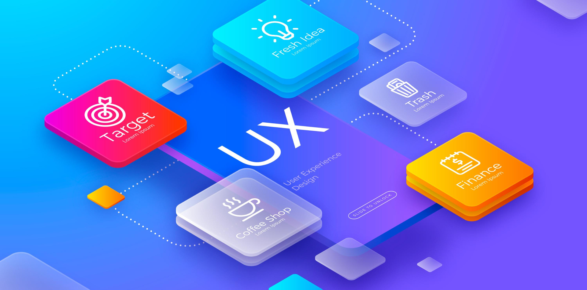
🎯 Why Designing for Small Screens Requires a Unique Approach
With more than 60% of global web traffic coming from mobile devices, designing for small screens is not just an option—it’s a necessity. Unlike desktop interfaces, where space is plentiful, mobile UI/UX design requires precision, efficiency, and an intuitive user experience to keep users engaged.
A well-designed mobile app should:
✅ Be easy to navigate with limited screen space.
✅ Ensure fast interactions to keep users engaged.
✅ Follow mobile-first principles for a seamless experience.
✅ Be accessible to all users, including those with disabilities.
Let’s explore key best practices to ensure your mobile app UI/UX is optimized for smaller screens while maintaining a great user experience.
📏 1. Responsive & Adaptive Layouts
Mobile screens come in various sizes, from compact smartphones to large tablets. Your UI should seamlessly adapt to different screen dimensions.
🔹 Best Practices for Responsive Design
✔ Use Flexible Grids: Instead of fixed-width layouts, use percentage-based designs to ensure fluid resizing.
✔ Optimize for Portrait & Landscape Modes: Ensure that the interface works smoothly in both orientations.
✔ Maintain a Consistent Design Across Devices: A user switching between mobile and tablet should experience the same design logic.
💡 Example: Google’s Material Design principles focus on adaptable, scalable designs that work across all screen sizes.
📌 2. Keep Navigation Simple & Intuitive
Navigation is critical on small screens because users don’t have the luxury of a full-size menu or sidebar.
🔹 Mobile-Friendly Navigation Strategies
✔ Bottom Navigation Bars: Place essential navigation at the bottom for easy thumb access.
✔ Hamburger Menus: Use them sparingly to keep the interface clutter-free.
✔ Gesture-Based Navigation: Allow users to swipe or tap to move between sections smoothly.
💡 Example: Instagram’s bottom navigation groups core features in an easy-to-reach layout, making navigation seamless.
🖋️ 3. Design for Touch, Not Clicks
Unlike desktops, where users use a precise mouse pointer, mobile screens rely on finger taps, swipes, and gestures.
🔹 How to Optimize for Touch Interactions?
✔ Make Buttons Large Enough: Tap targets should be at least 48×48 pixels to prevent accidental clicks.
✔ Provide Enough Spacing: Avoid placing interactive elements too close to each other.
✔ Use Gestures Wisely: Swiping, long-press, and pinch-to-zoom should feel natural, not forced.
💡 Example: Apple’s iOS Human Interface Guidelines recommend adequate padding and spacing to ensure touch accuracy.
⚡ 4. Optimize Content for Readability
Since mobile screens are small, text-heavy designs can overwhelm users. Your content should be concise, readable, and well-structured.
🔹 Tips for Better Readability
✔ Use Legible Fonts: Stick to sans-serif fonts with a minimum size of 16px.
✔ Break Up Content: Use short paragraphs, bullet points, and headings for better scanning.
✔ Use Contrast for Accessibility: Ensure text stands out against the background for easy reading.
💡 Example: Medium’s mobile interface uses a clean, readable font and high contrast for better content consumption.
🚀 5. Improve Loading Speed & Performance
Users expect fast-loading mobile apps. If your app is slow, they’ll leave.
🔹 Ways to Boost Mobile Performance
✔ Optimize Images: Use compressed image formats like WebP for faster load times.
✔ Minimize HTTP Requests: Reduce the number of server calls to speed up rendering.
✔ Implement Lazy Loading: Load images and content only when needed.
💡 Example: Facebook Lite is a lightweight version of the Facebook app optimized for slower networks and lower-end devices.
🔊 6. Accessibility: Designing for Everyone
A mobile app should be usable by all people, including those with disabilities.
🔹 Accessibility Best Practices
✔ Provide Sufficient Color Contrast: Ensure text and buttons stand out clearly.
✔ Enable Voice Navigation: Support screen readers like TalkBack (Android) and VoiceOver (iOS).
✔ Use Accessible Touch Targets: Make buttons large enough for users with motor impairments.
💡 Example: Spotify’s app includes dark mode, voice navigation, and large tap targets, making it accessible to all users.
🎯 Conclusion: Small Screen, Big Impact
Designing for small screens requires thoughtful UI/UX decisions that prioritize usability, efficiency, and accessibility.
✅ Keep navigation simple and intuitive.
✅ Design for touch-based interactions.
✅ Optimize content for readability.
✅ Ensure fast performance and accessibility.
By following these best practices, your mobile app UI/UX will offer a seamless and engaging experience for users on any screen size.
💡 What’s your biggest challenge in mobile app UI/UX design? Let’s discuss in the comments! 👇