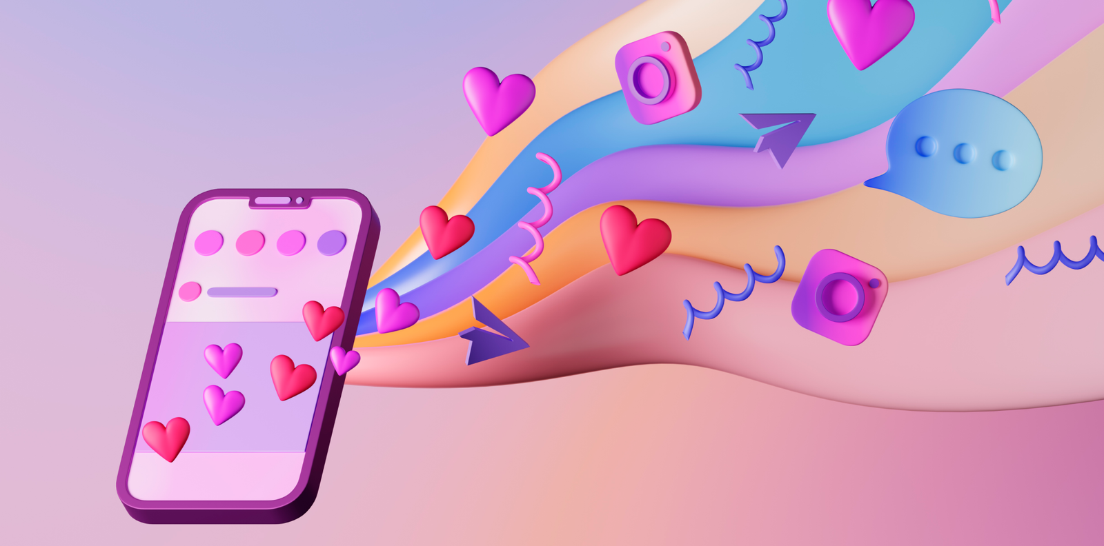
Design for Loyalty, Not Just Looks
In the hyper-competitive world of mobile apps, getting users to download your app is only the beginning. The real challenge? Keeping them engaged, active, and coming back again and again.
While features and performance matter, design is often the difference-maker in how users feel, interact, and stay loyal to your app. It’s not about aesthetics alone—it’s about how every swipe, tap, and scroll contributes to a seamless, engaging experience.
This guide walks you through actionable design strategies that enhance user engagement at every stage of your mobile app journey.

✏️ Why Engagement is a Design Responsibility
Design isn’t just decoration—it’s a core pillar of user interaction and retention. Great design:
🔹 Encourages deeper feature exploration
🔹 Reduces friction and frustration
🔹 Delivers instant feedback and satisfaction
🔹 Builds emotional connection with users
🔹 Turns one-time users into daily loyalists
If your app feels intuitive and rewarding, engagement becomes natural—not forced.
🧠 1. Prioritize Onboarding That Excites and Educates
First impressions shape user behavior. Your onboarding should feel like a warm welcome, not a crash course.
✅ Keep it short—2 to 3 screens max
✅ Use illustrations, animations, or microcopy to explain benefits
✅ Let users skip or come back later
✅ Show how quickly they can achieve value (e.g., “Get started in 60 seconds”)
A well-designed onboarding flow increases Day 1 retention—and reduces uninstalls.
🔍 2. Create a Navigation System That Thinks Like Your Users
Navigation should feel invisible and intuitive.
📌 Use a consistent bottom navigation or hamburger menu
📌 Make icons clear and labels readable
📌 Include search or filtering where needed
📌 Highlight the most-used features (like Home, Favorites, or Cart)
When users can find what they want fast, they’re more likely to stay engaged.
💬 3. Add Microinteractions That Reinforce Actions
Microinteractions are subtle animations or feedback loops that make apps feel alive.
💡 Button presses with ripple effects or color feedback
💡 Swipe gestures that animate with motion
💡 “Like,” “save,” or “complete” animations that celebrate user action
💡 Loading states with visual cues (like progress bars or playful loaders)
These tiny touches build user trust and reduce uncertainty in interactions.
⏳ 4. Guide Users with Progress, Streaks, and Gamification
People love progress—it gives them a reason to return.
🔑 Use checklists for tasks or onboarding steps
🔑 Display streaks for daily use (Duolingo does this brilliantly)
🔑 Offer badges or visual milestones
🔑 Show completion percentages for profiles, tutorials, or lessons
Gamification adds structure, satisfaction, and anticipation to the experience.
✅ 5. Personalize the User Journey Wherever Possible
Personalization makes your app feel like it was designed just for them.
🎯 Use the user’s name and preferences in messages
🎯 Display “Recently Viewed” or “Recommended for You” content
🎯 Offer theme or layout settings (light/dark mode, compact view)
🎯 Adjust onboarding or feature prompts based on user behavior
Tailored content = higher retention and better emotional connection.
💡 6. Time Your Notifications Thoughtfully
Push notifications can re-engage—or annoy. Smart design makes them valuable.
📣 Send based on user actions, not random timing
📣 Offer value-driven content (“You’ve unlocked a reward!” vs “Come back!”)
📣 Allow customization of notification preferences
📣 Avoid overuse—fewer, smarter messages win
Push with purpose, not pressure.
✨ 7. Use Color and Typography to Influence Emotion
Your visual style sets the tone for user experience. Design choices here go deeper than aesthetics.
🎨 Use vibrant colors to highlight actions and CTAs
🎨 Choose calming or energetic palettes based on app purpose
🎨 Keep typography legible at every screen size
🎨 Create contrast to direct focus and reduce strain
Visual hierarchy guides behavior—and good design speaks louder than words.
🧩 Real-World Example: Engagement Reimagined in a Habit Tracker App
A wellness brand found users dropping off after 3 days of use.
🔎 What changed?
🎯 Introduced a personalized greeting + daily quote
🎯 Added progress bars and goal reminders
🎯 Replaced static buttons with fun animations
🎯 Used friendly microcopy in empty states (“Don’t worry, your habits will grow 🌱”)
🎉 Result: 47% boost in 7-day retention and increased app ratings across platforms.
Design decisions = engagement outcomes.
⚠️ Avoid These Engagement-Killing Design Mistakes
Even with the best intentions, some designs lead to disengagement. Watch out for:
🚫 Complex onboarding with too many steps
🚫 Unclear CTAs or inconsistent navigation
🚫 Bland or generic visual style
🚫 No feedback on user actions
🚫 Push notifications that feel spammy
Design for delight, clarity, and consistency, and you’ll avoid these traps.
🧾 Final Thoughts: Engagement is a Design-Led Outcome
User engagement doesn’t depend solely on features—it depends on how users feel while using your product. When the design is fluid, intuitive, and rewarding, engagement becomes a natural behavior, not a marketing trick.
Design with purpose. Design with empathy. And most importantly—design with your users in mind at every step.
💬 Let’s Discuss: What App Keeps You Coming Back?
Is there an app you open every day because of its design? Drop it in the comments and tell us why—it might inspire someone’s next UX update! 👇


3 Comments
Olivia King
8 April 2025Brilliant insights! I love how this breaks down engagement as a design responsibility, not just a product or marketing one. 👏
Matt Jennings
8 April 2025The Duolingo streak mention hit home—I open it daily just for that satisfying flame icon. Design psychology at its finest!
Sophie Lane
8 April 2025Totally agree on microinteractions. It’s amazing how something as simple as a “liked” animation can make the user feel more connected. Great breakdown.