
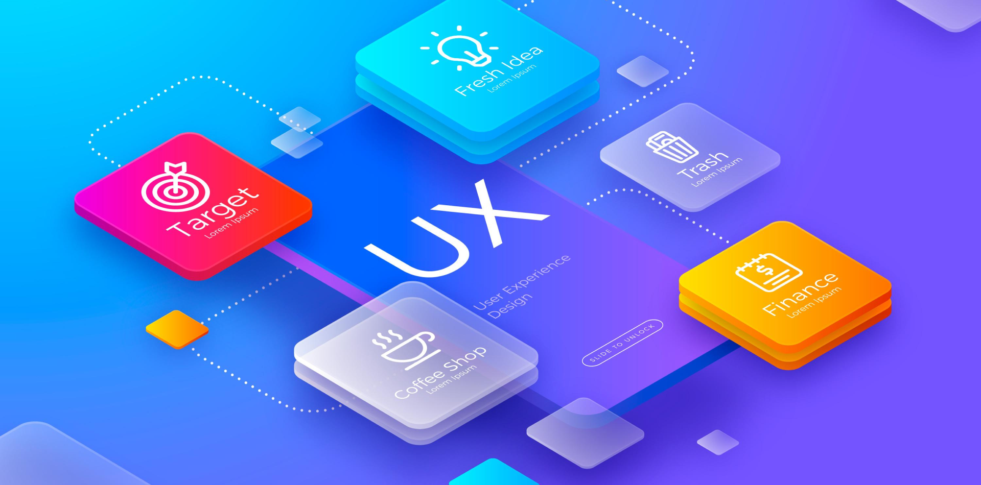
One App. Two Worlds.
Designing for mobile isn’t just about screen sizes—it’s about platform behavior, expectations, and interaction models.
iOS and Android users think differently, interact differently, and expect different visual and navigational standards. As a designer, your job is to bridge the gap—creating a consistent brand experience that still feels natively familiar across platforms.
In this blog, we’ll walk through strategies to optimize mobile app design for both iOS and Android, using smart UX principles and platform guidelines that keep users happy—wherever they are.
🧠 Already building a product? Check out our UX guide on Creating Intuitive User Flows

Why Platform-Specific Design Matters
Your app may have one codebase, but users don’t care about that. They care about how the app feels.
⚠️ Copy-paste UI from iOS to Android (or vice versa), and you risk:
❌ Confusing gestures
❌ Unexpected placements (like tabs or back buttons)
❌ Visual inconsistencies with OS-level UI
❌ Poor App Store/Play Store reviews
Native-feeling design = higher adoption, usage, and trust.
🎯 Key Differences Between iOS and Android Design
Before optimizing, you need to know how they differ:
| Element | iOS | Android |
|---|---|---|
| Navigation | Bottom Tabs + Swipe | Top Tabs + Hamburger/Bottom Nav |
| Buttons | Rounded, light shadows | Rectangular, flat or raised |
| Typography | San Francisco | Roboto |
| Back Action | Swipe from left | Back button (hardware/software) |
| Modals | Slide-up Sheets | Fullscreen or card-based |
| Icons | Line-based | Filled/outlined |
📚 Read official guidelines:
Step 1: Follow Native Guidelines—But Stay Brand Consistent
Start by aligning UI elements with each platform’s conventions:
✅ Use Material components on Android and UIKit/SwiftUI styles on iOS
✅ Customize tabs, alerts, inputs, and buttons based on platform
✅ Keep brand colors, logo, and typography consistent across both
💡 Use design tokens to sync color, typography, and spacing across platforms.
Step 2: Customize Navigation Flows per OS
Navigation is one of the biggest platform-sensitive components.
🧭 iOS:
-
Bottom tab bars are standard
-
Back gestures (swipe from edge) are common
-
Modals slide up from the bottom
🧭 Android:
-
Uses floating action buttons (FABs) for primary actions
-
Back button (hardware/software) is relied upon
-
Navigation drawers or top tabs are more common
One-size-fits-all navigation feels unnatural—tailor it to platform expectations.
Step 3: Design with Adaptive Layouts
Responsive design isn’t just for web—mobile apps need it too.
✅ Use auto layout (Figma) or constraints (Xcode/Android Studio)
✅ Support all screen sizes: mini phones to large foldables
✅ Don’t fix heights in pixels—use % or device-based units
✅ Ensure your UI scales well in landscape and portrait modes
📲 Tip: Test on actual devices or emulators like BrowserStack or Firebase Test Lab
Step 4: Respect Platform-Specific UX Patterns
Each OS trains users differently. Align your experience to:
🎨 iOS:
-
Clean, spacious, gesture-focused interfaces
-
Emphasizes clarity and focus
-
Uses tab bars, pickers, and minimal loading indicators
🤖 Android:
-
Dense, functional layouts
-
Emphasizes flexibility and custom views
-
Uses FABs, chips, and material motion transitions
📈 Design for the user’s mental model, not your designer preference.
Step 5: Use Cross-Platform Tools Strategically
Not building native? Tools like Flutter, React Native, or Xamarin allow shared codebases—with platform-specific tweaks.
🧩 Optimize with:
-
Conditional rendering (iOS vs Android layouts)
-
Platform-aware components (
Platform.OSin React Native) -
Custom wrappers for buttons, modals, etc.
-
Separate design tokens for spacing, radius, elevation
💡 Want to dive into Flutter design? Stay tuned for our upcoming guide on Designing with Flutter UI Kits.
Real-World Example: Cross-Platform Redesign Win
A fintech app initially launched with iOS-only UX patterns. When ported to Android, users were confused:
❌ No FAB
❌ Swipe gestures didn’t work
❌ iOS-style pickers felt clunky
They refactored to include:
✅ Android-native navigation
✅ Platform-specific button sizes and padding
✅ Unified brand language with local UI behavior
📈 Result: Android retention increased by 46% within 3 months.
User comfort = higher app success.
Common Mistakes in Multi-Platform Mobile Design
❌ Designing solely for iOS and porting to Android
❌ Ignoring accessibility differences (contrast, font scaling)
❌ Forcing web-style layouts into apps
❌ Using identical icons or gestures across OS without testing
❌ Skipping localization/internationalization for different regions
The best cross-platform apps feel uniquely native on both platforms.
Tools to Help Optimize Design for Multiple Platforms
🛠 Figma Variants – For creating platform-specific components
📱 Zeplin – Platform-aware developer handoff
⚙️ FlutterFlow – No-code Flutter builder with cross-platform logic
🔁 Supernova – Turn design systems into production code
🔗 Figma Tokens Plugin – For design tokens across iOS/Android
Final Takeaway: One Brand, Two Experiences
Cross-platform mobile app design isn’t about uniformity—it’s about unified experiences that feel platform-native.
💡 iOS and Android have different cultures, gestures, and UI norms.
💡 Your app should speak both dialects fluently, while still feeling like you.
So start with the user. Speak their platform’s language. And deliver a design that feels like it belongs—wherever it lives.
💬 What’s Your Cross-Platform Design Hack?
Do you start with native or use a hybrid system?
Share your go-to tools or tricks in the comments 👇 and let’s learn together!
4 Comments
David Chen
2 July 2025“Design for the user’s mental model, not your designer preference.” That hit hard and true. 🙌
Serena Li
2 July 2025The real-world fintech example is gold. Shows how small native tweaks can lead to major engagement gains 👏
Rafael Torres
2 July 2025Perfect mix of UX theory and platform-specific detail. This should be required reading for anyone working with React Native or Flutter.
Ethan Roy
2 July 2025This blog is chef’s kiss for hybrid app teams. Bridging brand consistency while staying OS-native is an underrated skillset