Some products age like wine. Others age like expired milk.
But what if you could bring a legacy product back to life—without losing its soul?
Redesigning a well-known product isn’t just about UI polish. It’s about understanding how today’s users think, what they expect, and where modern tech and design principles can bridge the gap between old functionality and new experiences.
In this case study, we’ll walk through the full redesign journey of a classic SaaS platform—originally built in the early 2010s—and how it was evolved into a modern, intuitive, and scalable product.
🧠 The Challenge: Outdated UX, Loyal Users
The original product had been around for over a decade.
📦 It served thousands of B2B customers
🖥️ The interface was desktop-only and cluttered
🧭 Navigation was confusing, and new users churned fast
🧓 Long-time users had developed muscle memory and resistance to change
The goal? Modernize the experience without alienating the existing base.
🎯 Related: The Role of Feedback in the Design Process
🔍 Phase 1: Researching the Old to Shape the New
We didn’t start with Figma.
We started with questions.
📞 Conducted 1:1 interviews with long-time and new users
🎥 Screen-recorded sessions to observe workflow friction
📊 Analyzed customer support tickets for recurring UX issues
📁 Audited existing UI to map features vs usage frequency
🔎 Key insights:
✅ Users loved the product logic—but hated the UI complexity
✅ 40% of users only used 3 core features
✅ The navigation menu had over 16 items (!)
💡 Takeaway: Clarity was more valuable than complexity.
🧠 Related: Effective User Research for Product Design
✏️ Phase 2: Mapping Out the Redesign Strategy
We built a clear roadmap based on findings:
🧭 Simplify navigation: Group related tools and reduce visual noise
📱 Make it responsive: Many users now accessed via tablet/laptop
🧠 Improve onboarding: Add tooltips, tutorials, and empty state copy
🎨 Modernize design system: New typography, spacing, and color scales
🔁 Add consistency across modules that were previously designed in silos
We created user flows, low-fidelity wireframes, and ran early concept tests.
✅ Tools used: Figma, FigJam, Notion, Loom, Hotjar
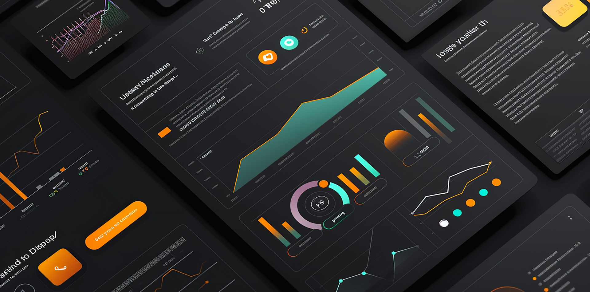
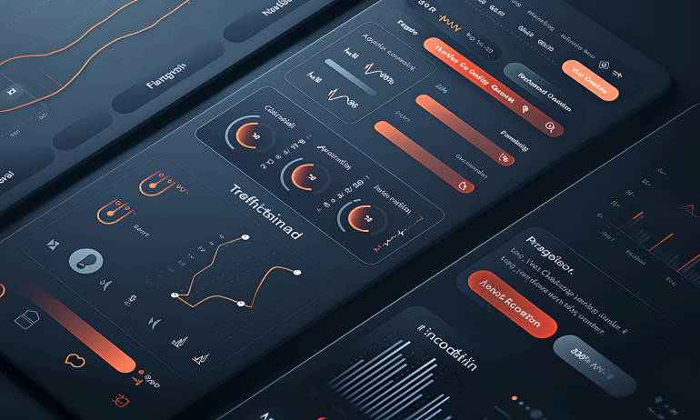
🎨 Phase 3: Design Execution — With Users at the Center
We followed a progressive rollout model:
1️⃣ Redesigned the core dashboard first
2️⃣ Rolled out new UI modules every sprint (biweekly)
3️⃣ Collected live user feedback via in-app surveys
4️⃣ Offered a “Switch to Classic” option to reduce resistance
5️⃣ Created short, contextual videos for onboarding
✨ Design upgrades:
✅ Clean layout with collapsible sidebars
✅ Modular cards instead of long tables
✅ Light/dark mode
✅ Faster load times with optimized front-end assets
✅ WCAG-compliant contrast & font sizes
📈 The Results: From Legacy to Loved
The final rollout was completed over 3 months—and here’s what happened:
📉 45% drop in support tickets about navigation
📈 3x increase in dashboard usage
🚀 +18% in user retention over 60 days
🧠 92% of surveyed users said the new version was “more intuitive”
❤️ Only 6% reverted to the old UI after 2 weeks
Most importantly?
We didn’t lose our core users—we grew their loyalty.
⚠️ Redesigning? Avoid These Common Pitfalls
🚫 Changing everything at once (users panic)
🚫 Ignoring power users and their habits
🚫 Overdesigning with trends instead of usability
🚫 Forgetting about performance and accessibility
🚫 Launching without phased rollout/testing
🧠 Related: Designing Websites with SEO in Mind
🔁 What We Learned
📌 Redesigns aren’t about visual updates—they’re about clarity and relevance
📌 Small wins (like reducing clicks) matter more than big aesthetic shifts
📌 Talking to real users reveals what data alone can’t
📌 Rolling out in phases minimizes friction
📌 Preserving the soul of the product is just as important as modernizing it
🧾 Final Takeaway: Honor the Old, Design for the Now
Redesigning a classic product is like renovating a historic home.
You keep the structure, upgrade the experience, and respect the loyalty it earned.
So if you’re working on revamping something old:
🎯 Talk to users before you touch a pixel
🎯 Simplify, don’t just beautify
🎯 Test and listen more than you design
🎯 Treat feedback as your roadmap
Modern design isn’t just visual—it’s thoughtful, adaptive, and human.
💬 Have You Ever Redesigned Something Classic?
What lessons did you learn?
What was harder than expected?
Drop your thoughts, stories, or even before/after shots in the comments below 👇


3 Comments
Thomas Gray
6 August 2025“Age like expired milk” 😂 Best opening line I’ve read all week. Brilliant case study!
Natalie Brooks
6 August 2025Switching to classic mode as a rollout safety net = genius!
Jack Thompson
6 August 2025Loved how you balanced legacy loyalty with modern usability 👏 That’s hard to pull off!