
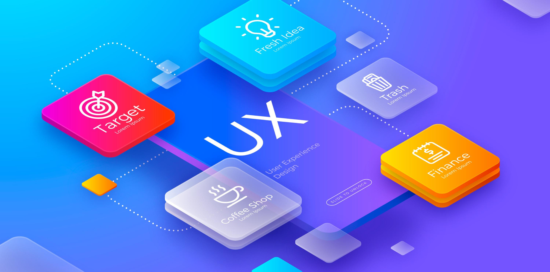
One Experience, Every Device
In today’s mobile-first world, one thing is clear:
📱 Your app needs to work everywhere.
Users interact with apps on phones, tablets, foldables, and even desktops—often switching between them within minutes. If your design doesn’t adapt, your experience breaks. That’s where responsive design comes in.
Responsive design ensures that your app looks great and functions smoothly—no matter the screen size or device type.
Let’s explore how to build mobile apps that are not only beautiful but fluid, flexible, and future-proof.

📐 What Is Responsive Design in Mobile Apps?
Responsive design is the practice of designing your app’s UI to adapt dynamically to different screen sizes, resolutions, and orientations.
It’s not just about shrinking things down—it’s about reflowing content, realigning layouts, and ensuring functionality stays intact.
🎯 Small screen? Show stacked content
🎯 Larger screen? Use side-by-side layouts
🎯 Different orientation? Rearrange buttons for better accessibility
In short: your interface responds to the user’s context, not the other way around.
📲 Why Responsive Design Is Non-Negotiable in Mobile UX
Inconsistent UI = lost users. Here’s why responsive design is essential:
✅ Device diversity is growing – From iPhone Minis to iPads and Android tablets, screen sizes vary dramatically
✅ Users expect seamlessness – They notice when something’s off—too small, misaligned, or broken
✅ Cross-platform consistency matters – Many apps now function across web, mobile, and even wearables
✅ Reduces dev and maintenance costs – One adaptive design saves time vs. building device-specific versions
✅ Improves accessibility and usability – Everyone benefits when content adjusts to their device and needs
Responsive design isn’t just about aesthetics—it’s about inclusivity, scalability, and retention.
📏 Step 1: Start with a Mobile-First Mindset
The best responsive apps don’t just scale down desktop views—they’re designed from the ground up for mobile.
🌱 Focus on core actions users need on smaller screens
🧠 Prioritize content that drives value, cut unnecessary fluff
👆 Optimize for touch interactions, not mouse clicks
⚡ Minimize load times with optimized assets and clean code
Mobile-first isn’t just a strategy—it’s a philosophy that ensures your app meets users where they are.
🖼 Step 2: Use Flexible Layout Grids and Units
Rigid designs break. Flexible grids bend without snapping.
📐 Use relative units like %, vw, vh, em—not fixed px sizes
🔲 Design with 8pt or 4pt grids to maintain spatial consistency
🔁 Let containers stretch or stack based on screen real estate
📱 Leverage breakpoints for key device categories (phones, tablets, desktops)
This ensures your UI adjusts fluidly—without weird overlaps or awkward spacing.
🔄 Step 3: Optimize for Orientation Changes
Don’t forget users rotate their devices. Your design should rotate too.
📱 Portrait mode = vertical flow, scrolling content
📟 Landscape mode = split views, wider nav, multi-column layouts
🧩 Use media queries or device APIs to detect and adjust UI instantly
🔁 Keep buttons and touch targets accessible in both modes
💡 Tip: On tablets, consider “master-detail” views in landscape—users expect split interfaces like email apps.
💬 Step 4: Prioritize Scannability and Tap Targets
Responsive design isn’t just visual—it’s behavioral.
👆 Touch targets should be at least 44x44pt
📏 Line lengths should stay readable (~45–75 characters per line)
🧠 Avoid crowding—give fingers room to scroll, tap, and swipe
📵 Collapse secondary features behind menus or modals to avoid clutter
The goal is effortless interaction, even on the smallest screen.
📊 Real-World Example: Responsive Design Done Right
An e-commerce startup launched their app with a desktop-inspired layout on mobile. Results?
📉 High bounce rate
📉 Low conversion on smaller devices
📉 Users dropped off during checkout
After redesigning with responsiveness in mind:
✅ Stacked layout for product listings
✅ Sticky “Add to Cart” button for thumb-access
✅ Adaptive image resizing and carousel
✅ Fluid checkout flow optimized for one-handed use
📈 Result: 45% increase in conversions and 30% boost in session time.
A responsive redesign literally paid off.
⚠️ Common Mistakes to Avoid in Responsive Design
Even experienced designers can get tripped up. Watch out for:
❌ Designing for one screen and “hoping it scales”
❌ Overloading small screens with content
❌ Hiding essential features behind too many taps
❌ Forgetting to test on actual devices (emulators ≠ real UX)
❌ Inconsistent padding, margins, or typography between screens
Responsive design should be intentional, not accidental.
🔮 The Future: From Responsive to Adaptive Intelligence
As device diversity continues to grow, the future of responsive design lies in adaptive and intelligent UIs.
Think layouts that change based on:
📍 Location or context (in-store, driving, resting)
🕰 Time of day (dark mode, quick actions at night)
🧠 User behavior (frequent features shown first)
💬 Accessibility needs (voice, motion, contrast)
Responsive design is the baseline. Intelligent adaptation is the next frontier.
🧾 Final Takeaway: Build for Screens, Not Just Pixels
Your app is more than screens and buttons—it’s a living experience across devices, orientations, and users.
Responsive design is how you future-proof that experience. It’s how you stay usable, accessible, and competitive in a crowded app market.
Design responsively. Develop flexibly. Deliver delightfully.
💬 How Do You Approach Responsive Design?
Are you team mobile-first, or do you build one layout and adapt later? Share your tips, tools, or even your favorite framework for responsive mobile apps 👇