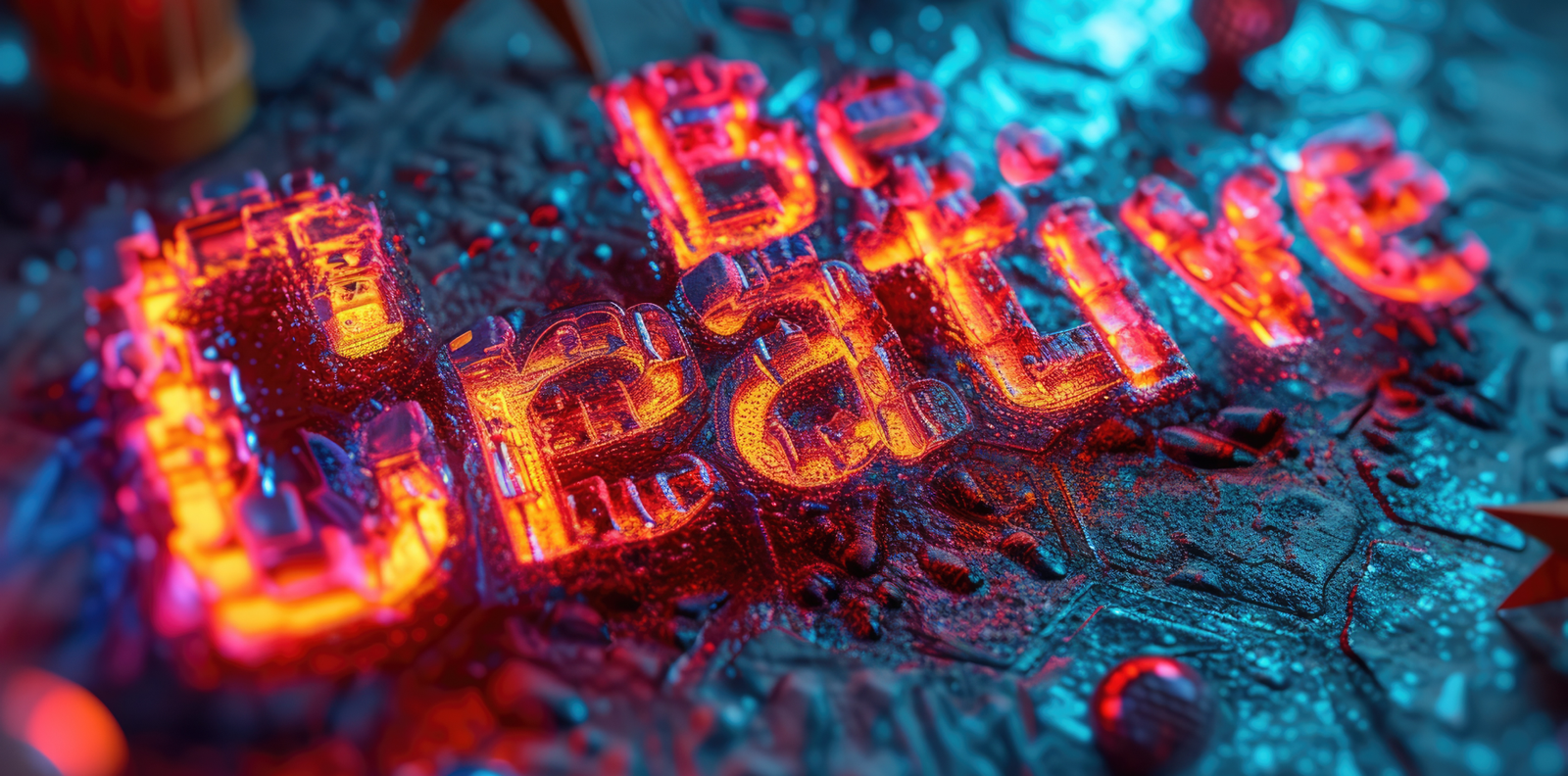
Typography is more than just arranging letters on a page—it’s about shaping perception and emotion. The right typeface doesn’t just look good; it guides the reader’s experience, affecting how they hear and feel the words in their mind.
A bold, uppercase font commands attention like a powerful speech. A soft, flowing script whispers like a gentle melody. The space between letters, the rhythm of the text, and the contrast of colors all contribute to how typography communicates without sound.
If typography lacks voice, it becomes invisible. If it lacks emotion, it fails to connect. Let’s explore how typography can be both audible and felt in design.
🎯 How Typography Speaks Without Sound
👉 Font Choice Creates Tone and Personality
Different fonts express different emotions and moods:
✔ Serif fonts (e.g., Times New Roman, Garamond): Trustworthy, professional, and traditional.
✔ Sans-serif fonts (e.g., Helvetica, Futura): Clean, modern, and direct.
✔ Script fonts (e.g., Pacifico, Dancing Script): Elegant, personal, and expressive.
✔ Bold, uppercase fonts: Strong, commanding, and authoritative.
✔ Light, italic fonts: Soft, delicate, and sophisticated.
👉 Spacing and Rhythm Affect Readability
✔ Kerning (letter spacing): If letters are too close, text feels cramped. If too far apart, it feels disconnected.
✔ Leading (line spacing): Proper spacing makes reading smooth, while poor spacing creates visual noise.
✔ Tracking (word spacing): Adjusting the overall spacing between words affects flow and clarity.
👉 Typography Hierarchy Guides the Eye
✔ Large, bold headlines draw immediate attention and set the context.
✔ Subheadings create structure and help with easy scanning.
✔ Body text should be clear, readable, and effortless to follow.
👉 Color and Contrast Influence Visual Perception
✔ High-contrast typography (e.g., black on white) feels strong and authoritative.
✔ Soft pastel hues create a calming and friendly reading experience.
✔ Bright, vibrant colors add energy and excitement to the design.
🎯 How Typography Evokes Emotion
👉 The Right Font Creates Connection
Typography shapes how users feel about a brand or message. A handwritten font makes a note feel personal, while a sleek, geometric typeface adds a sense of precision and professionalism.
👉 Serif vs. Sans-Serif – Classic vs. Modern
✔ Serif fonts create a feeling of trust and heritage, perfect for newspapers, law firms, and luxury brands.
✔ Sans-serif fonts feel clean and minimalist, often used in tech brands, startups, and modern websites.
👉 Script & Handwritten Fonts – Personal & Expressive
✔ A script font mimics handwriting, making a message feel human and intimate.
✔ Brush and calligraphy styles add an artistic touch, making typography feel handcrafted and elegant.
👉 Geometric & Bold Fonts – Strength & Confidence
✔ Strong, geometric fonts project power and stability, often used in corporate branding.
✔ Thick, blocky letters feel grounded and bold, leaving a lasting impact.
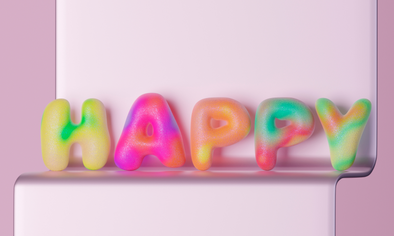
👉 Rounded & Playful Fonts – Friendly & Approachable
✔ Rounded fonts have soft edges that make them feel warm and inviting.
✔ They work well in brands targeting younger audiences or products with a fun, relaxed vibe.
🎯 Best Practices for Typography That Speaks & Connects
👉 Match Typography to the Brand’s Personality
A law firm should use a professional serif font, while a children’s book should have a playful, rounded typeface. Fonts should reflect the brand’s identity and audience.
👉 Use a Strong Visual Hierarchy
Headlines should be bold and engaging, while body text should be easy to read. Typography should guide the reader’s eyes smoothly through the content.
👉 Limit Font Pairings for a Cohesive Look
Using too many fonts creates visual chaos. Stick to two or three complementary fonts to maintain clarity and harmony in design.
👉 Optimize Typography for Readability Across Devices
Typography should be tested on mobile, desktop, and print to ensure it remains legible and effective on all platforms.
👉 Test and Refine for Maximum Impact
Good typography isn’t just about aesthetics—it’s about how it feels and performs. Testing different styles ensures the right balance between readability and emotional impact.
Final Thoughts
Typography is more than just choosing a font—it is the voice and personality of written content. It influences how a message is received, whether it feels authoritative, warm, energetic, or calming. When typography is designed with intention, it does more than just look good. It resonates.
💬 Which fonts make you feel something? Share your favorites in the comments!


17 Comments
Oliver Grant
13 February 2025Typography is the silent storyteller of design. This was a great read! 📖
Ethan Coleman
13 February 2025A bold font speaks with confidence, a soft script whispers—brilliant perspective! 🎨
Ava Richardson
13 February 2025Typography truly shapes emotion. This post made me appreciate it even more!
Mason Phillips
13 February 2025Fonts are like voices—choose the right one, and the message becomes powerful. 🎙️
Isabella Wright
13 February 2025Loved the breakdown of how different fonts create different emotions! 🎯
Lucas Perry
13 February 2025Typography is design’s unspoken language. This post captures that perfectly!
Lily Carter
13 February 2025This made me rethink how I use fonts in my designs. Super valuable insights! 💡
Noah Jameson
13 February 2025Great typography makes words come alive—this explains why beautifully!
Emma Daniels
13 February 2025The idea of typography being ‘audible’ is such an interesting take. Love it!
Caleb Morgan
13 February 2025A font isn’t just a style—it’s a feeling. This breakdown was spot on! 👌
Harper Sullivan
13 February 2025The way typography guides emotions is fascinating. Amazing insights!
Benjamin Hayes
13 February 2025Typography without voice is just decoration. This post captures its essence! 🎨
Olivia Bennett
13 February 2025Choosing the right typeface is like picking the right soundtrack. It sets the tone!
Jacob Turner
13 February 2025Serif vs. Sans-serif, bold vs. delicate—each choice changes perception. Great post! ⚖️
Zoe Mitchell
13 February 2025Typography is emotion in visual form. Loved every bit of this post! ✨
Avery Peterson
13 February 2025A single font choice can change an entire message. This post highlights why!
Daniel Lawson
13 February 2025Typography is the body language of text. This was an amazing read!