✨ Introduction: The Luxury Users Don’t Shout About
In the world of fashion, “quiet luxury” is about understated elegance — quality that speaks softly, not loudly. No logos, no noise — just detail, craftsmanship, and intention.
That same mindset is entering the digital product space.
Today’s premium users aren’t wowed by visual overload or trendy animations. They crave experiences that feel exclusive, intentional, and deeply refined. They don’t want to be impressed. They want to feel understood.
In this blog, we’ll explore how to translate quiet luxury into interface design — creating digital products that whisper value, not scream for attention.
🧠 1. Understanding the Psychology of Quiet Luxury
Quiet luxury isn’t about minimalism alone.
It’s about discernment.
🔸 Users feel calm, not stimulated
🔸 Quality is felt in performance, not flash
🔸 Every interaction is effortless but elevated
🔸 It appeals to emotional confidence, not insecurity
This emotional undertone shifts the entire product strategy — from copywriting to color, from onboarding to offboarding.
👉 Internal Link:
Explore how design builds trust & loyalty →
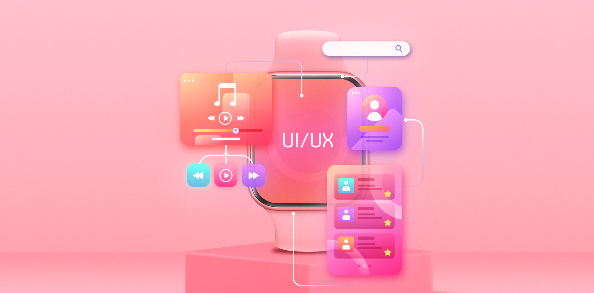
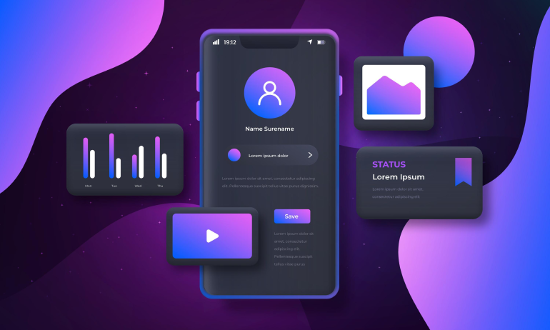
🎨 2. Visual Aesthetics: Less Visual, More Intentional
Quiet luxury design is visually restrained but emotionally rich.
Here’s what defines its look:
🔹 Neutral color palettes – Think cream, stone, slate, or deep navy
🔹 Generous whitespace – It creates calm and a feeling of importance
🔹 Refined typography – Serif fonts, tall x-heights, no decorative clutter
🔹 Micro-interactions – Smooth, slow, and subtle
🔹 No visual noise – Every element earns its place
In products like Apple’s Settings app, Notion’s new onboarding, or Arc Browser’s UI, luxury is in the quiet.
📱 3. Functionality That Feels Effortless
When we talk about quiet luxury in UX, we’re talking about polished, invisible functionality.
Here’s how it shows up:
🔸 Onboarding is short — but incredibly contextual
🔸 Animations exist — but serve emotion, not ego
🔸 Load times are minimal — because time is value
🔸 Microcopy is precise, not chatty
🔸 Actions are predictable, not playful
Quiet luxury is not boring — it’s intentional, predictable, and deeply reassuring.
📘 External Link:
See Apple’s Human Interface Guidelines →
💼 4. Use Cases: Where Quiet Luxury Works Best
You’ll find quiet luxury applied to:
- Fintech apps targeting high-net-worth users (e.g. Wealthsimple, Zeller)
- High-end wellness platforms (e.g. Oak Meditation, AURA)
- Private communities or members-only tools
- Enterprise tools for C-suite executives
- Luxury e-commerce brands (e.g. Loewe, Mr Porter)
In all of these, the common denominator is emotional sophistication.
You’re not showing off. You’re inviting the user into confidence.
🌍 5. Global Trend: Why This Matters Now
With flashy design everywhere, the pendulum is swinging back.
Today’s users — especially millennials and Gen Z in higher income brackets — seek calm over clutter, depth over dopamine.
They don’t want to scroll endlessly. They want clarity, respect, and quiet excellence.
Designing for quiet luxury aligns with:
🔹 Growing digital fatigue
🔹 Rise of slow living and mindfulness
🔹 Desire for meaningful, intentional interaction
🔹 Shift from “cool” to confidently classic
👉 Internal Link:
See how cultural context shapes product design →
💎 6. Real Example: The Rise of “Tactile Digital”
A premium travel app recently redesigned their booking flow.
Their old design had bright CTA buttons, bold icons, and playful animations.
The new one?
✅ Pale stone tones with smooth transitions
✅ Serif fonts with subtle hover effects
✅ Soft sound haptics that echoed luxury watches
✅ Clean navigation that focused on purpose, not promotion
Result?
📈 42% increase in repeat usage by business travelers.
Not because it was flashy — but because it felt exclusive, focused, and effortless.
⚠️ 7. Mistakes to Avoid When Designing Quiet Luxury
Just because it’s minimal doesn’t mean it’s easy. Many confuse quiet luxury with:
❌ Cold or empty UI
❌ Bland or generic typography
❌ Removing features instead of refining them
❌ Overusing dark or beige themes without context
❌ Ignoring brand personality altogether
Quiet luxury isn’t “less” — it’s more of what matters.
You still need soul. You still need surprise.
You just don’t show off about it.
🔐 Final Takeaway: Mastering the Art of Subtle Excellence
Designing for quiet luxury is about more than UI.
It’s about the emotional posture of your product — calm, considered, composed.
In a world that moves fast, flashes bright, and screams for attention, your product becomes the one that whispers something worth staying for.
It doesn’t need to prove anything. It just needs to feel right.

