
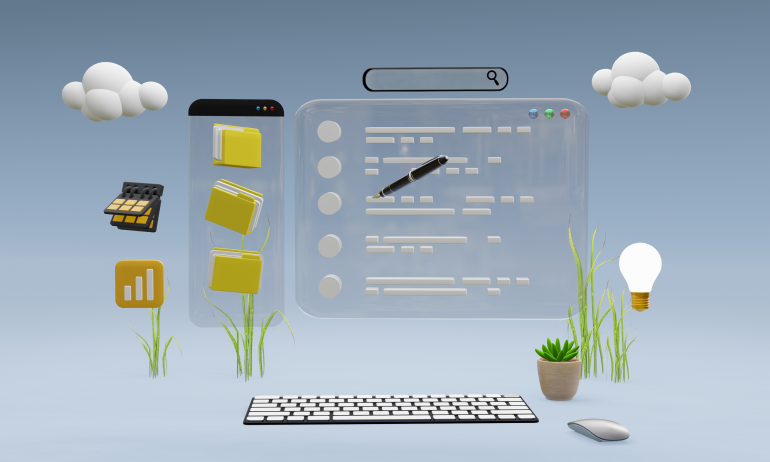
Good Data Means Nothing Without Clarity
SaaS users don’t just need data—they need understanding. From founders checking growth charts to managers monitoring KPIs, users rely on visual cues to make fast, confident decisions.
But raw data can overwhelm. Without thoughtful design, dashboards become confusing walls of numbers. That’s why data visualization is more than decoration—it’s core UX.
In SaaS product design, data must be clear, useful, and beautifully simple. Here’s how to get it right.
🔍 Why Data Visualization Is a UX Priority in SaaS
Most SaaS platforms are built around insights. Whether it’s marketing metrics, user behavior, or financial trends, data is the heartbeat of decision-making.
🧠 Visuals help users grasp patterns quickly
📈 Charts reduce cognitive load compared to tables
🖼 Well-structured data builds trust and usability
⏱ Faster comprehension leads to faster actions
If your users can’t interpret the data, they won’t use the product. It’s that simple.
🧱 Key Elements of SaaS Data Visualization Design
📌 Structure Before Style
A sleek chart means nothing if it doesn’t answer a question.
🔹 Define what the user needs to see (daily trend, total, comparison?)
🔹 Choose the right layout: grid, dashboard tiles, sidebar navigation
🔹 Group related insights to reduce visual fatigue
Design starts with intention, not color palettes.
📌 Choose the Right Chart for the Job
Each chart type tells a different story. Use them wisely.
📊 Bar charts: best for comparisons
📉 Line graphs: ideal for trends over time
📈 Area charts: useful for volume-based changes
📍 Heatmaps: great for behavior or frequency analysis
📦 Pie charts: limited—use sparingly and only for simple splits
Avoid visual noise. More doesn’t always mean better.
📌 Use Color and Contrast to Guide Attention
Color isn’t just visual—it’s emotional and directional.
🎨 Use brand-consistent but meaningful colors (green = success, red = risk)
🎨 Highlight spikes, drops, or changes using contrast
🎨 Avoid rainbow charts—too many colors = confusion
🎨 Use light backgrounds and bold labels for data clarity
Your goal? Make users notice what matters—instantly.
📌 Prioritize Real-Time and Interactivity
SaaS is dynamic. Your data should be too.
⚙️ Let users filter, sort, and select data ranges
⚙️ Offer tooltips with extra details (without cluttering the view)
⚙️ Use hover or tap states for deeper insights
⚙️ Refresh visuals in real time if the data changes frequently
Empower users to explore, not just observe.
📌 Mobile-Friendly Doesn’t Mean “Shrink It”
Designing charts for mobile? Don’t just scale things down.
📱 Simplify data views—focus on key metrics only
📱 Use tappable, collapsible widgets instead of full dashboards
📱 Stack charts vertically and ensure readability at small sizes
📱 Use micro visualizations (like spark lines) to give at-a-glance insight
Mobile users need fast insight, not full control.
💡 Real-World Example: Visual Design Transforms User Engagement
A SaaS tool for eCommerce analytics had great features—but 70% of users didn’t return after day one.
What changed?
🔧 Replaced text-heavy reports with compact, interactive graphs
🔧 Simplified dashboards based on job role (manager, analyst, CMO)
🔧 Highlighted key changes (sales spikes, drop-offs) with contrast
🔧 Added export options and real-time alerts
⚡ Result: Session time doubled, churn rate dropped, and feedback soared.
Better visuals didn’t just make it prettier—it made the product usable.
🚫 Common Mistakes to Avoid in Data Visualization
Even solid products can fail here. Avoid these:
❌ Dumping too much data at once
❌ Using flashy charts that confuse users
❌ Relying on color alone (consider colorblind accessibility)
❌ Skipping mobile optimization
❌ Forgetting that some users are non-technical
Your visuals should educate, not overwhelm.
🧾 Final Takeaway: Design Data for Decisions, Not Just Display
In SaaS, users rely on your product to understand performance, guide strategy, and solve problems. Data visualization is how you make that possible—fast, clean, and confidently.
Design with insight in mind. Focus on what your users need to know—not just what you can show.
A beautiful chart means nothing if it doesn’t help someone take action.
💬 What’s Your Favorite SaaS Dashboard?
Seen a dashboard that nailed both visuals and clarity? Or one that totally missed? Share your thoughts below—we’re always learning. 👇


5 Comments
Oliver Shaw
15 April 2025Bookmarking this. It’s rare to see data visualization explained so clearly for SaaS teams—designers and PMs alike.
Hannah West
15 April 2025This is a great resource I’m sharing with my dev and product team. Data UX should always be a collaboration, not an afterthought.
Luke Bennett
15 April 2025I used to think more charts = more value. Now I realize more often means more confusion. Thanks for the practical advice!
Emily Grant
15 April 2025The section on real-time interactivity hit home. Our users love tooltips + filtering, and it’s improved our engagement metrics big time.
Matt Nichols
15 April 2025“Mobile doesn’t mean shrink it”—👏👏 This alone should be a poster in every SaaS design sprint. Really useful tips here.