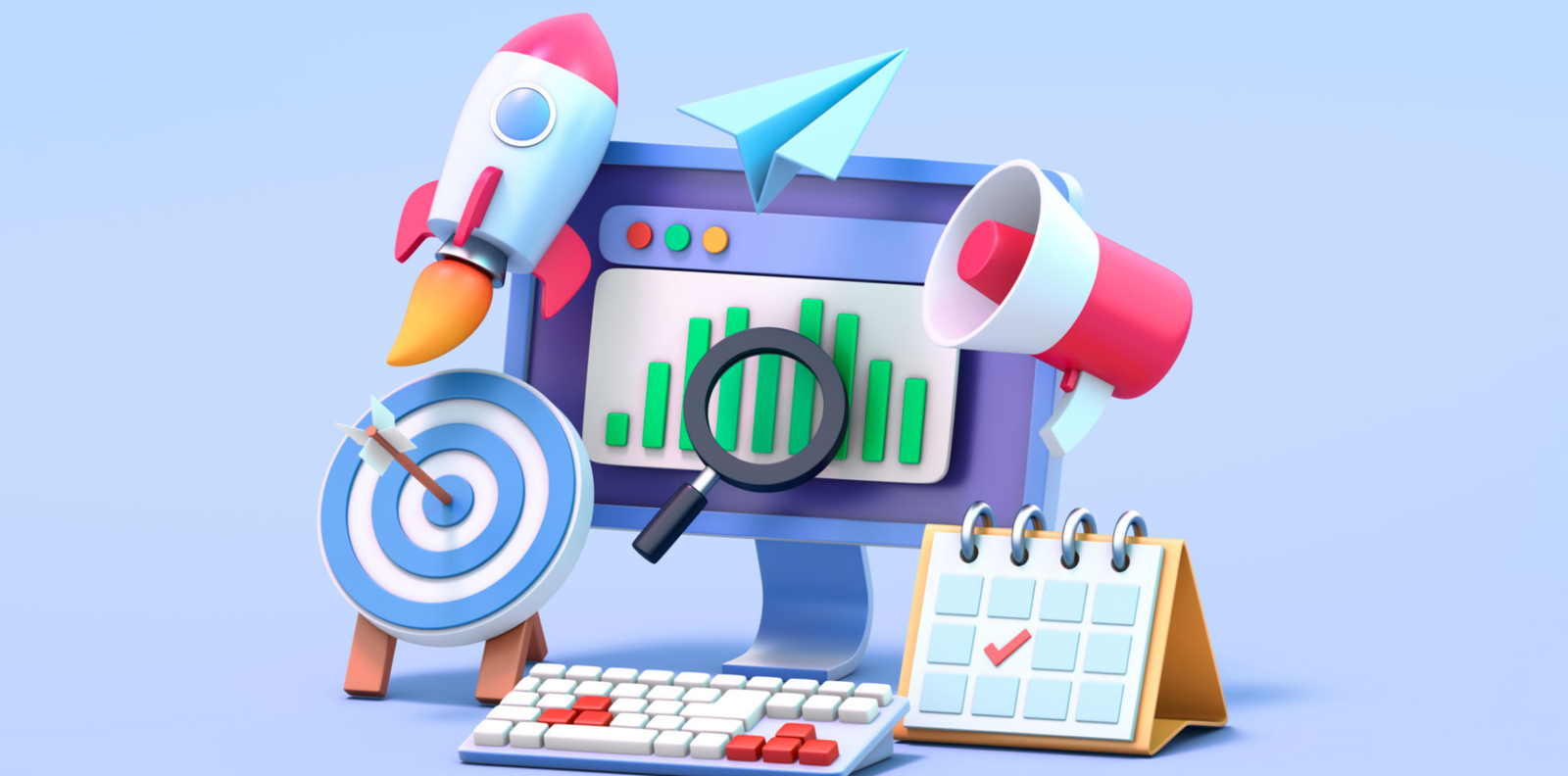
In today’s digital world, attention spans are shrinking. Users skim through content in seconds, deciding whether to stay or move on. Good design doesn’t just look appealing—it compels users to explore further.
Think about the last time a website, product, or app truly caught your attention. What made you stay? Was it a striking visual? A well-structured layout? Or a seamless interaction? Great design creates intrigue, guiding users deeper into the experience.
Let’s break down how effective design sparks curiosity and keeps users engaged.
🖌 Visual Appeal: The First Hook
👀 First Impressions Matter
Users judge a website or product within 0.05 seconds. If the design is cluttered, outdated, or uninviting, they leave. But if it’s visually appealing, they stay—and explore.
🎨 Color Psychology Plays a Role
Colors evoke emotions and set the tone for interaction. For example:
🔵 Blue builds trust (used by brands like Facebook & LinkedIn).
🟢 Green signifies growth and balance (popular in finance & wellness).
🔴 Red grabs attention and creates urgency (seen in CTA buttons).
🔠 Typography Influences Readability
Good typography isn’t just about style—it guides the reader. A clear, readable font hierarchy makes content inviting and digestible.
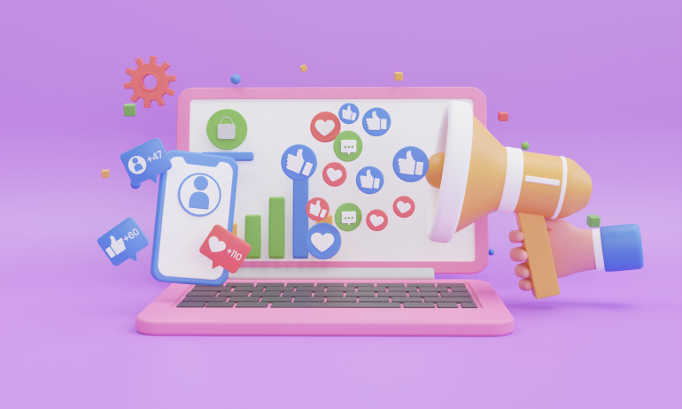
🖼 Imagery & Graphics Tell a Story
Compelling visuals enhance understanding and evoke emotion. Whether it’s high-quality photography, custom illustrations, or infographics, visuals draw people in.
📖 Content & Design: A Perfect Partnership
📌 Design Should Lead to Discovery
A strong visual layout encourages users to explore deeper—whether it’s a blog post, product page, or landing page. The goal is to keep them interested, not just entertained.
✅ Clear Navigation = Smooth Experience
If users have to search for information, they won’t stay long. Good design ensures:
🎯 Easy-to-find menus
🎯 Logical content flow
🎯 Consistent visual hierarchy
📑 Whitespace Creates Focus
Cluttered designs overwhelm users. Whitespace (empty space around elements) helps guide the eye and makes content feel more digestible.
💡 Microinteractions Keep Users Engaged
Small, subtle animations—like hover effects, loading transitions, and button animations—make interactions feel rewarding and encourage further exploration.
🔍 How to Design for Curiosity & Engagement
✨ Use Engaging Headlines & CTA Buttons
Strong headlines spark curiosity and well-placed CTA buttons encourage action. Example:
🚀 Instead of “Learn More”, try “Discover How This Works”
✨ Design for Scannability
Most users scan before they read. Use:
✔ Bold subheadings
✔ Bullet points (or emoji points ✅)
✔ Short paragraphs
✨ Incorporate Storytelling Elements
People connect with stories more than raw information. Use design to tell a compelling visual story—whether it’s through imagery, typography, or animations.
✨ Test & Optimize for Engagement
A/B testing helps determine what works best for keeping users engaged. Experiment with layouts, visuals, and copy to find what resonates.
🏆 Final Thoughts: The Role of Design in User Engagement
A well-designed experience does more than just look good—it creates an invitation for users to dive deeper. Whether it’s a website, app, or product, good design should spark curiosity, build trust, and encourage action.
Before launching any design, ask yourself:
🎯 Does this design make users want to explore more?
🎯 Is it visually engaging but also functional?
🎯 Are users being guided naturally through the experience?
If the answer is yes, you’ve created a design that not only looks good but works beautifully—and that’s what great design is all about.
💬 What are your thoughts on curiosity-driven design? Let’s discuss in the comments! 🚀


1 Comment
Emma Carter
20 February 2025“Users judge a website within 0.05 seconds”—crazy but so true! First impressions are everything.