
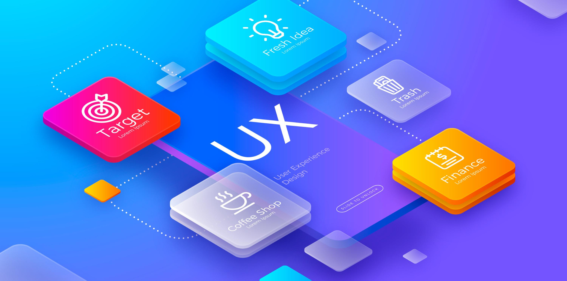
Small Screens, Big Expectations
In today’s world, users don’t just expect mobile apps to work—they expect them to work beautifully. They demand speed, clarity, and simplicity, all from a screen that fits in their hand.
Designing mobile interfaces isn’t just about shrinking a desktop experience. It’s about rethinking the experience entirely—for touch, for motion, for focus.
Let’s dive into the essential best practices that will make your mobile UI intuitive, efficient, and irresistible.

🧠 Why Mobile Interface Design Requires Special Attention
Mobile is unique because:
📱 Screens are smaller, so space is precious
👆 Interaction is touch-based, not mouse-driven
🚶 Users are often multitasking and distracted
⚡ Performance and responsiveness matter even more
Design for the reality of mobile use—not just the beauty of mobile screens.
📐 1. Prioritize Content and Actions
On mobile, less isn’t just more—it’s essential.
🔸 Focus on the core actions users want to take
🔸 Trim content ruthlessly—every word and pixel must earn its place
🔸 Keep interfaces free of clutter and distractions
🔸 Use progressive disclosure to hide secondary options
Design for the moment, not for endless exploration.
📏 2. Design for Touch, Not Clicks
Touch introduces a whole new set of design rules.
🔹 Keep tap targets large enough (at least 44x44px)
🔹 Space interactive elements to avoid mis-taps
🔹 Use thumb-friendly zones—design for one-hand use
🔹 Provide immediate visual feedback on touches
The smoother the physical interaction, the better the emotional experience.
🖋 3. Simplify Navigation Flows
Mobile users won’t dig through complex menus.
📂 Keep primary navigation visible or easily accessible
📍 Use bottom nav bars, hamburger menus, or swipe gestures
🔎 Add prominent search features for larger apps
📍 Minimize the number of screens needed to complete a task
Every extra step = friction. Cut it wherever you can.
🧩 4. Embrace Native Patterns and Familiar Gestures
Don’t reinvent common behaviors unless you have a very good reason.
🧠 Follow platform conventions (iOS vs Android standards)
🔄 Use familiar gestures like swipe, pull-to-refresh, pinch-to-zoom
🎛 Keep settings, profile, and help sections where users expect them
📚 Make your interface feel natural without needing a manual
Familiarity = faster adoption.
🎨 5. Focus on Readability and Visual Clarity
Text and visuals must communicate instantly.
🔸 Use large, legible fonts
🔸 Maintain strong color contrast for text and UI elements
🔸 Stick to a clean color palette (no visual overload)
🔸 Support dark mode where possible for user preference
On small screens, clarity wins over creativity every time.
⚙️ 6. Speed, Feedback, and Performance Matter
Mobile users won’t tolerate lag or confusion.
⚡ Design lightweight interfaces that load instantly
🔄 Provide immediate feedback for every action (loading spinners, progress bars)
🎯 Use skeleton screens instead of blank loading pages
📥 Optimize images, animations, and API calls for fast load times
Every second you save improves user satisfaction—and retention.
✨ Real-World Example: Mobile-First Success Story
A fintech app struggled with high churn during onboarding. Their fix?
✅ Simplified the signup to just 2 screens
✅ Used large buttons and clear calls-to-action
✅ Added tiny success animations after each completed field
✅ Optimized images to reduce app size by 30%
📈 Result: 65% improvement in user completion rate within 3 weeks.
Better mobile design didn’t just look better—it felt better.
⚠️ Common Mistakes in Mobile UI Design
Even seasoned designers can miss these:
❌ Cramming desktop features into mobile screens
❌ Making tap targets too small or too close
❌ Overcomplicating onboarding flows
❌ Ignoring platform-specific guidelines
❌ Designing only for one-hand or one device type
Test often, test early—and always design with real usage in mind.
🧾 Final Takeaway: Design for Fingers, Eyes, and Minds
Mobile app interfaces aren’t just mini web pages. They’re dynamic experiences designed for real people, moving through real life, at real speed.
When you prioritize clarity, touch-friendliness, performance, and familiarity, you don’t just build a functional app—you create a memorable experience.
And that’s how you turn casual downloads into loyal users.
💬 What’s Your Favorite Mobile Design Trick?
Have a go-to rule for designing mobile apps that always works for you? Drop your tip, favorite tool, or mobile hack in the comments 👇
4 Comments
Noah Fletcher
29 April 2025Absolutely loved the reminder to design for thumbs, not clicks! It’s crazy how often that’s overlooked. Great tips throughout!
Sophia Evans
29 April 2025“Every word and pixel must earn its place”—couldn’t agree more. Space is premium on mobile. Fantastic read! 📱
Liam Carter
29 April 2025The fintech app example really hit home. Tiny changes like reducing form fields can have such a massive impact on retention.
Amelia Green
29 April 2025I always tell my team: simplicity isn’t easy—it’s essential on mobile. Loved how clearly this was laid out!