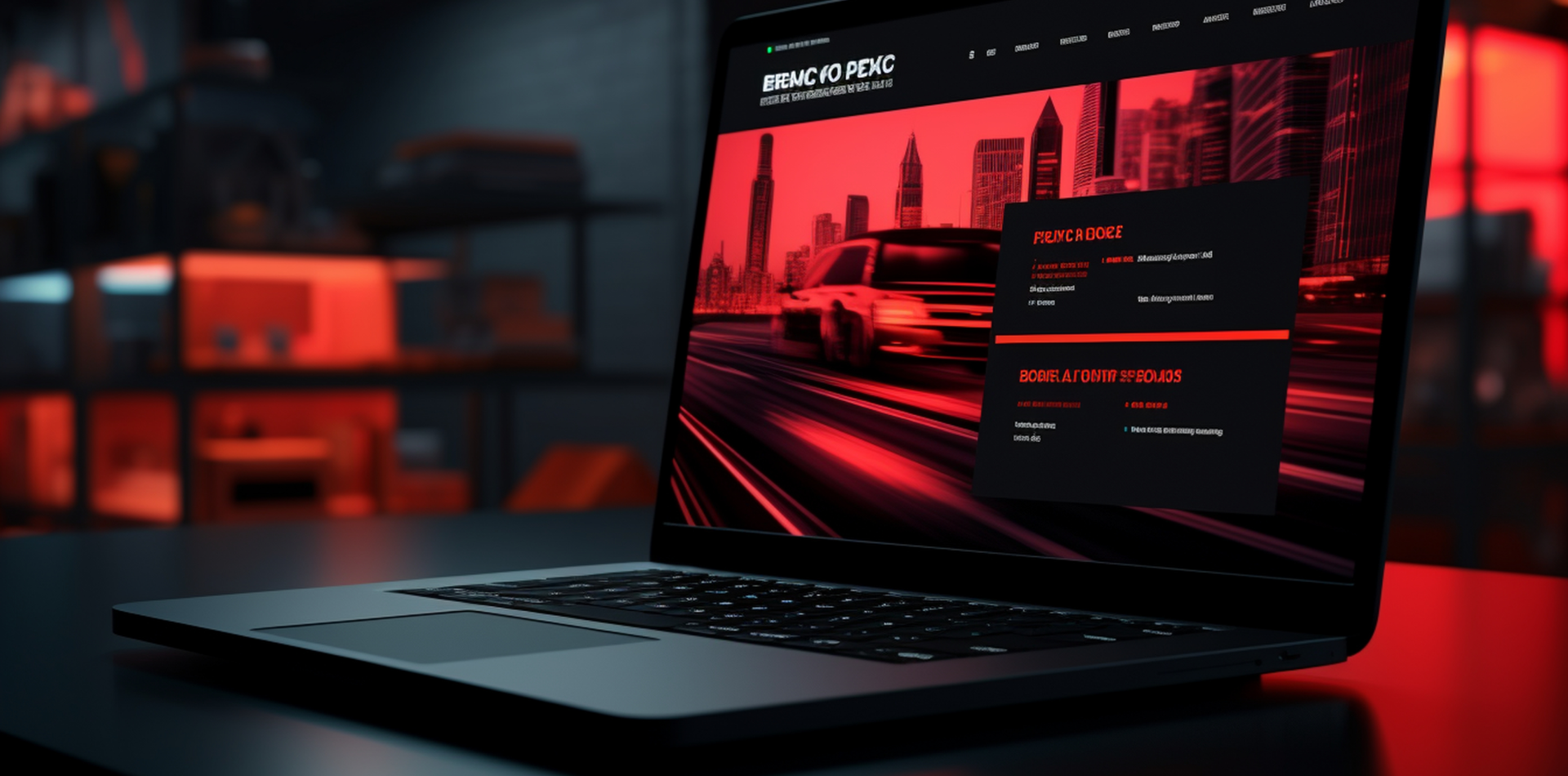
A Modern Site Is More Than a Pretty Face
Websites are no longer just online brochures—they’re products, experiences, and brands in motion.
In 2024 and beyond, a modern website must do more than “look good.” It needs to load fast, adapt smartly, guide users, and convert clearly. Whether it’s a portfolio, SaaS homepage, or eCommerce store, your site is only as good as its design foundations.
Let’s break down the essentials of modern website design so your next site looks amazing—and performs even better.

🧠 Why Modern Design Is Non-Negotiable
Visitors judge your brand in seconds. And if your website feels outdated, slow, or confusing, they’ll leave—fast.
🔹 First impressions are design-driven
🔹 Performance affects SEO and retention
🔹 Modern UX builds trust and usability
🔹 Clean design = clearer messaging and action
Your website isn’t just a page—it’s a first handshake.
🧩 1. Responsive Layouts for Every Screen
Modern users visit your site from phones, tablets, desktops—even TVs.
📱 Use fluid grids and flexible containers
📏 Design mobile-first, then scale up
🔁 Ensure components reflow naturally (not just shrink)
👆 Prioritize tap-friendly UI over hover-heavy features
Design must feel native on any device, any time.
⚡ 2. Speed and Performance Optimization
A beautiful site means nothing if it loads in 6 seconds.
🚀 Compress images and use next-gen formats (WebP, AVIF)
⚙️ Lazy-load below-the-fold content
🧹 Minify code, remove unused scripts, and defer JavaScript
📊 Use Lighthouse or PageSpeed Insights for real feedback
Fast = functional. Fast = favorable on Google.
🎯 3. Clear Visual Hierarchy
Structure guides behavior. Users follow your visual cues.
🔸 Use headings, subheadings, and spacing consistently
🔸 Highlight your main CTA with size, color, or position
🔸 Group related content visually (cards, sections, grids)
🔸 Avoid overwhelming users with equal-weight content
If everything is loud, nothing gets heard.
🎨 4. Minimalist but Intentional Design
Less is more—but only if “less” is strategic.
🔹 Use a limited color palette with contrast and consistency
🔹 Stick to 1–2 fonts across the site
🔹 Replace stock clutter with clean whitespace
🔹 Animate sparingly for flow, not flash
Every design choice should support clarity and conversion.
🧰 5. Smart Navigation and Structure
Modern sites need to feel easy—even if they’re content-rich.
🔸 Use sticky navs, scroll indicators, and dropdowns sparingly
🔸 Offer breadcrumbs or multi-level navigation if needed
🔸 Keep main menu under 6 core items
🔸 Ensure internal links and structure match the user journey
The best navigation is the one the user barely notices.
🖋 6. High-Quality Content That Converts
Design sets the tone—but content seals the deal.
📣 Write benefit-driven headlines, not just feature lists
🖊 Use microcopy to guide interaction (buttons, forms, prompts)
📸 Support content with relevant visuals—not just decoration
📩 Create CTAs that feel personal, not pushy
Design brings users in—copy keeps them there.
✨ Real-World Example: The Power of Streamlined Design
A creative agency rebuilt its outdated, image-heavy homepage:
✅ Switched to modern type with a lighter color scheme
✅ Reorganized content using clear section cards
✅ Cut homepage load time from 5.1s to 1.3s
✅ Boosted CTA click-through rate by 48%
They didn’t add more. They designed with intention—and it worked.
⚠️ Common Design Mistakes to Avoid
Even good designers can miss the mark:
❌ Overloading with animations or carousels
❌ Using unclear or overly clever navigation labels
❌ Ignoring contrast, leading to poor accessibility
❌ Designing desktop-only experiences
❌ Focusing on aesthetics before performance or content
Modern means fast, usable, and focused.
🧾 Final Takeaway: Design with Purpose, Build with Users in Mind
Modern website design isn’t just about trends—it’s about timeless clarity, real-world usability, and clean performance.
When you focus on these essentials, you don’t just create a site that looks modern—you build an experience that feels modern, and users will notice.
Don’t just impress. Engage. Deliver. Convert.
💬 What’s One Thing You Think Every Modern Website Should Include?
Drop your favorite modern design tip, feature, or tool in the comments below 👇
Let’s build better together.


3 Comments
Chris Fulton
6 May 2025“Your website isn’t just a page—it’s a first handshake.” Loved that line. Nailed the reality of first impressions in digital design!
Alyssa James
6 May 2025Clear, concise, and on point. Every client should read the section on performance before asking for a 10MB video banner 😅
Devon Murray
6 May 2025The “minimalist but intentional” part really resonated. Less isn’t always more unless there’s clarity behind it. Great write-up!